What is Included in Website Design?
Are you considering getting a new website for your business and are you wondering what is included in website design?
Website design is more than just making things look pretty. It’s about making your online space easy to explore and enjoy.
Imagine your favourite book – it’s not just the story inside, but also how the pages are laid out, the fonts used, and the pictures that make it all come alive.
Similarly, a well-designed website combines colours, fonts, and pictures to tell your story and make it easy for visitors to find what they’re looking for.
In this article, we’ll take a closer look at the different parts that make up a website. From the way it looks on your screen to how it behaves when you click around, each detail plays a role in creating a smooth and enjoyable visit.
Whether you’re a business owner wanting to showcase your products or someone who wants to share their story, understanding website design is like learning the secret language of the internet.
So, let’s explore the world of website design together, unravelling its mysteries, and discovering why it’s not just about colours and pixels, but a clever mix of creativity and practicality. Whether you’re here to create a digital storefront for your business or carve out your unique space online, let’s make your mark on the internet!
Visual Elements
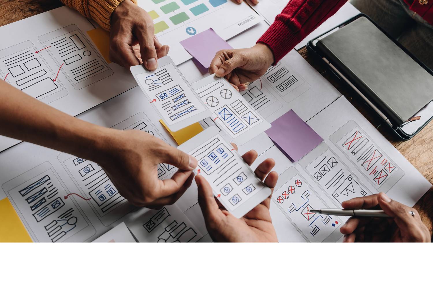
Layout and Grid
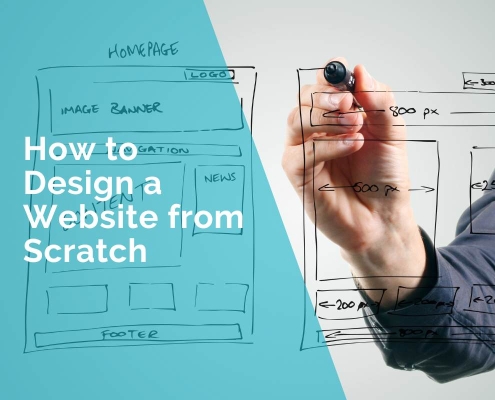
The layout serves as the foundation, determining how content is organized on a webpage. A well-thought-out grid structure ensures a harmonious arrangement, making it easy for visitors to navigate and find what they’re looking for. Imagine it as the blueprint that guides users seamlessly through your digital space.
Colour Scheme
Colours evoke emotions and set the tone for your website. The choice of a colour scheme goes beyond personal preference; it’s a strategic decision that influences how users perceive your brand. Whether it’s a vibrant palette for an energetic vibe or muted tones for a more sophisticated feel, the colour scheme is a powerful communicator of your brand identity.
Typography
The fonts you choose contribute significantly to the readability and personality of your website. Clear and well-selected typography enhances the user experience, making content easy to consume. Fonts convey a message – from the playful script for a creative touch to a clean, sans-serif font for a modern look – each typeface contributes to the overall visual narrative.
Imagery and Graphics
Visual content, including images and graphics, adds life and context to your website. High-quality, relevant imagery not only enhances the aesthetic appeal but also communicates your message effectively. Whether it’s product photos, illustrations, or infographics, these visual elements serve as powerful tools to engage and captivate your audience.
“Website design is like crafting a digital journey with pictures, easy ways to get around, and cool things to click. It’s making a friendly space online for everyone to explore.”
Ivana Katz
Navigation
Website design’s essence lies in effective navigation, a key element encapsulating layout, user-friendly interfaces, and logical flow. Delving into “what is included in website design,” navigation stands as the crucial framework, akin to a well-marked trail leading visitors effortlessly through the digital landscape.
Navigating through a website should be as smooth as strolling through a well-organized store, guiding visitors effortlessly to their desired destination. Let’s unravel the crucial components of website navigation with a focus on simplicity and user-friendliness:
Menu Structure
The menu is the roadmap of your website. A clear and organized menu structure ensures that visitors can quickly find what they’re looking for. Think of it like the sections in a bookstore – each category is clearly labelled, making it easy for customers to locate their preferred genre. For instance, an e-commerce site may have categories like “Clothing,” “Electronics,” and “Home Goods,” streamlining the user’s journey.
User Flow
User flow is the natural progression a visitor takes through your website. It’s about creating a seamless path from landing on the homepage to completing a desired action, whether it’s making a purchase or filling out a contact form. Consider a news website where the user flow leads readers from headlines on the homepage to specific articles, ensuring a logical sequence that keeps them engaged.
Intuitive Navigation
Intuitive navigation means anticipating the user’s needs and making it easy for them to move around. It’s like a well-designed amusement park where signposts direct visitors to attractions. For instance, a service-oriented website might have a prominent “Get Started” button, guiding users to essential steps or information without confusion.
In various industries, these principles of navigation remain constant.
In e-learning, for example, a clear menu structure might include sections like “Courses,” “Resources,” and “FAQs.”
In healthcare, a user flow could guide patients from the homepage to appointment scheduling or informational resources.
Regardless of the industry, intuitive navigation is the compass that ensures visitors have a pleasant and purposeful experience on your website.
Responsiveness
Your website must be like a chameleon, adapting seamlessly to various devices to provide an optimal user experience. Let’s dive into the critical aspects of responsiveness, ensuring your website shines across all screens:
Cross-Device Compatibility
Your website should be a flexible performer, delivering a consistent and enjoyable experience whether accessed from a desktop, laptop, tablet, or smartphone. Just like a versatile tool that fits comfortably in your hand, cross-device compatibility ensures that visitors can engage with your content effortlessly, regardless of the device they choose. For instance, an online store with cross-device compatibility allows users to browse products, make purchases, and track orders seamlessly from their preferred device.
Mobile Optimization
With the surge in mobile device usage, optimizing your website for smaller screens is no longer an option but a necessity. Mobile optimization involves tailoring the layout, content, and functionality to suit the constraints and capabilities of smartphones. Imagine a restaurant website where mobile optimization allows users to easily view the menu, make reservations, and access location information with just a few taps.
Flexible Grids and Images
A responsive website employs flexible grids and images that adapt to the screen size. This is similar to having a painting that adjusts its size without losing its beauty. Flexible grids ensure that content is arranged in a visually appealing manner, while images resize intelligently, maintaining clarity and impact.
Consider a photography portfolio where flexible grids showcase the artist’s work in an aesthetically pleasing manner, whether viewed on a large desktop monitor or a compact smartphone screen.
These responsive design principles aren’t confined to a specific industry; they’re the bedrock of a positive user experience across the board.
Whether you’re running an educational platform, a news website, or an e-commerce store, responsiveness ensures your audience can engage seamlessly, fostering satisfaction and loyalty. It’s not just about fitting into screens; it’s about standing out on every device.
Interactivity
Unveiling the layers of “what is included in website design,” interactivity emerges as a key player. Beyond static layouts, it introduces dynamic elements like buttons, forms, and animations, crafting an immersive online experience that captivates and involves users.
Buttons and Calls to Action
Buttons and calls to action (CTAs) are like friendly guides ushering visitors toward the desired actions on your website. Think of them as helpful assistants in a store, encouraging customers to explore and make decisions.
For instance, an e-commerce site might strategically place buttons like “Add to Cart” or “Checkout Now,” while a nonprofit organization’s website could feature CTAs like “Donate Now” or “Join the Cause,” prompting visitors to actively participate.
Forms and Input Fields
Forms and input fields are the interactive forms of communication on your website. Streamlined and user-friendly forms are like efficient reception desks – collecting information without causing frustration. Consider a travel booking website where intuitive input fields make it easy for users to enter travel details and preferences, ensuring a smooth booking process.
Feedback and Animation
Feedback and animation elements add a touch of dynamism, providing users with instant responses to their actions. It’s like the responsive feedback you get when pressing elevator buttons – a reassuring blink to let you know your request is acknowledged. In a real estate website, for example, interactive maps with animations can provide a visual representation of property locations and details, enhancing the user’s exploration experience.
Interactivity isn’t limited by industry boundaries; it’s a universal language that enhances user engagement.
Whether you’re running a blog, a healthcare platform, or an entertainment site, strategically placed buttons, user-friendly forms, and subtle animations breathe life into your digital space, making it more inviting and enjoyable for visitors.
The goal is not just to present information but to create an interactive journey that leaves a lasting impression.
Content
Textual Content
Words wield immense power in conveying your message, and textual content forms the backbone of your website. Imagine it as the narrative of a compelling story, with each page and paragraph guiding visitors through your digital tale. For instance, a law firm’s website might use clear and concise language to communicate legal services, ensuring that visitors can easily grasp complex information.
Multimedia Elements
Multimedia elements, including images, videos, and audio, add layers of richness to your content. They are the visual and auditory companions that amplify your message. Think of them as the illustrations in a children’s book – they captivate attention and enhance understanding. In the tourism industry, for instance, a travel blog might use stunning images and videos to showcase picturesque destinations, transporting visitors virtually to far-off places.
Information Hierarchy
Information hierarchy is the strategic organization of content, ensuring that the most important information takes centre stage. It’s akin to a well-organized library, where key books are prominently displayed. For a corporate website, an information hierarchy might prioritize essential details such as company values, services, and contact information, creating a user-friendly experience for potential clients.
Across diverse industries, the nuances of content creation remain paramount. Whether you’re managing an educational website, an e-commerce platform, or a healthcare portal, crafting compelling textual content, incorporating captivating multimedia elements, and establishing a clear information hierarchy are fundamental to capturing and retaining your audience’s attention. It’s not just about what you say; it’s about how you say it and how well your content resonates with your audience, leaving a lasting impression.
User Experience (UX) Considerations
Usability
Accessibility
Accessibility is the cornerstone of a website’s usability. It’s about ensuring that everyone, regardless of abilities or disabilities, can easily navigate and interact with your digital space. Imagine a public transportation website with features like text-to-speech functionality and high contrast options, making it inclusive and accessible to all users.
User-Friendly Interface
A user-friendly interface is the welcoming handshake extended to your visitors. It involves designing layouts and interactions that are intuitive and easy to understand. For example, an e-learning platform might employ a straightforward navigation structure and clear instructions, ensuring a user-friendly interface that promotes effective learning.
Consistency
Consistency breeds familiarity, and a consistent design across your website ensures a cohesive user experience. Think of it like the layout of a supermarket – you know where to find the milk because it’s consistently placed in the dairy section. Consistency in a news website, for instance, ensures that readers can quickly locate categories, headlines, and navigation tools, fostering a sense of reliability.
Performance
Page Load Speed
Speed matters in the online world, and a fast page load is the golden ticket to retaining impatient visitors. Consider an e-commerce site where swift page load speeds translate to a seamless shopping experience, reducing bounce rates and increasing customer satisfaction.
Server Response Time
The server response time is the heartbeat of website performance. A responsive server ensures quick interactions between the user’s browser and your website. In the realm of online gaming, for instance, low server response times are crucial for a smooth and enjoyable gaming experience without lag or delays.
Optimization Techniques
Optimization techniques involve fine-tuning your website to operate at its peak efficiency. This could include compressing images, minifying code, and leveraging browser caching. In the realm of digital marketing, a blog that employs optimization techniques ensures that content loads swiftly, capturing and retaining the attention of readers.
Accessibility
Inclusive Design
Inclusive design goes beyond meeting basic accessibility standards; it’s about creating a digital environment that welcomes everyone. Think of it as designing a public park with ramps and pathways accessible to all. In the healthcare sector, for example, an inclusive design ensures that medical information is presented in a format suitable for diverse audiences, promoting health literacy for all users.
Compliance with Web Content Accessibility Guidelines (WCAG)
Adhering to the Web Content Accessibility Guidelines (WCAG) is the roadmap to ensuring your website is universally accessible. It’s like building a bridge that complies with safety regulations. Compliance in a government website, for instance, guarantees that citizens with disabilities can access vital information and services without barriers.
Importance of Accessibility Features
Accessibility features, such as alternative text for images and captions for videos, are the keys to unlocking your content for a broader audience. In the world of entertainment, for instance, a streaming platform’s inclusion of subtitles and audio descriptions ensures that individuals with hearing or visual impairments can fully enjoy movies and TV shows.
Prioritizing user experience considerations is not just a best practice; it’s a commitment to creating a digital space that resonates with and serves all users effectively. Whether you’re operating in the realm of education, e-commerce, or public services, a user-centric approach enhances engagement, builds trust, and ensures that your website is a destination users return to with pleasure.
Testing and Quality Assurance
Cross-Browser Compatibility
Testing your website across various browsers is like rehearsing for a grand performance on different stages. Each browser interprets code differently, and cross-browser compatibility testing ensures your website looks and functions seamlessly for users, regardless of their chosen browser. Imagine an online retail store that undergoes cross-browser testing to ensure that customers enjoy a consistent shopping experience, whether they use Chrome, Firefox, Safari, or Edge.
Functional Testing
Functional testing is the meticulous examination of each component and feature to ensure they perform as intended. It’s like checking every instrument in an orchestra to guarantee they play the correct notes. In the realm of a banking website, functional testing ensures that account logins, transaction processes, and account statements work flawlessly, providing users with a secure and reliable online banking experience.
Performance Testing
Performance testing is the assessment of your website’s speed, responsiveness, and stability under varying conditions. It’s comparable to tuning a sports car to handle different terrains without losing speed. Consider an online news platform where performance testing ensures that the website can handle spikes in traffic during breaking news without compromising load times or crashing, delivering real-time updates to users.
User Testing
User testing is the final dress rehearsal before the big show, where real users interact with your website to uncover any usability issues. It’s like having a focus group critique a new movie before its release. In the realm of an educational platform, user testing involves students navigating the website, providing valuable insights into user experience, interface intuitiveness, and potential areas for improvement.
Testing and quality assurance serve as the backbone of a reliable and user-friendly website. Whether you’re managing an e-commerce site, a healthcare portal, or a social media platform, the commitment to thorough testing ensures that your digital creation not only meets industry standards but surpasses user expectations. It’s the final step in perfecting your online performance, guaranteeing that users encounter a seamless and enjoyable journey every time they visit your website.
Trends and Innovations in Website Design
Current Design Trends
Current design trends are the pulse of modern aesthetics, reflecting the zeitgeist of web creativity. One prominent trend is the use of vibrant and bold colours, injecting energy and personality into websites. Think of it as a splash of colour on a blank canvas, capturing attention and making a lasting impression. This trend is particularly evident in industries such as fashion and lifestyle, where visual appeal is paramount.
Another trend is the prevalence of minimalist design, emphasizing simplicity and clean layouts. This trend echoes the less-is-more philosophy, providing users with a focused and distraction-free experience. In industries like tech or SaaS (Software as a Service), where clarity and functionality are crucial, minimalist design ensures users can navigate effortlessly and focus on essential information.
Emerging Technologies
AI and Machine Learning
AI and machine learning are the powerhouse technologies reshaping the user experience landscape. From personalized recommendations to chatbots providing real-time assistance, AI enhances user engagement. Consider an e-commerce platform employing AI to analyze user preferences and offer tailor-made product suggestions, creating a more personalized and satisfying shopping journey.
Voice User Interface (VUI)
Voice user interfaces are transforming the way users interact with websites. The rise of virtual assistants like Siri and Alexa showcases the potential of VUI. In the hospitality industry, for instance, a hotel website could integrate VUI to enable users to inquire about room availability, make reservations, or access local information through voice commands, providing a hands-free and convenient experience.
Augmented Reality (AR) and Virtual Reality (VR)
AR and VR are pushing the boundaries of immersive experiences. In industries like real estate, AR can allow users to visualize how furniture would look in their homes before making a purchase. VR, on the other hand, is revolutionizing the travel industry by offering virtual tours of destinations, providing users with a taste of the experience before booking their trips.
Staying open to these trends and embracing emerging technologies is not just a strategy; it’s a commitment to providing users with cutting-edge and enjoyable digital experiences. Whether you’re in e-commerce, healthcare, or travel, incorporating these design trends and technologies elevates your website beyond the ordinary, ensuring it stands out in the ever-expanding digital landscape. It’s not just about keeping up; it’s about leading the way in creating digital experiences that captivate and resonate with your audience.
Website design integrates key elements to ensure a seamless user experience. Visual elements such as layout and imagery create an aesthetically pleasing design. Navigation, marked by a user-friendly interface, guides visitors effortlessly. Responsiveness adapts the site to various devices, while interactivity engages users actively. Compelling content, whether textual or multimedia, communicates effectively. User experience considerations prioritize usability, performance, and accessibility. Rigorous testing ensures flawless functionality, and staying current with design trends and emerging technologies adds a futuristic touch. In summary, website design harmonizes creativity, functionality, and user-centricity for a memorable digital experience.

The end result? Professional, custom-made sites that give your business the extra oomph it needs to stand out from the competition and make an impact.
Whether you’re a brand-new business or an established one ready to improve your digital presence, Ivana makes it easy to get your business online very quickly. Her websites are professional, tailored to fit your budget, and give your business a serious boost.
Download your FREE copy of “Ultimate Website Design Secrets Blackbook – 10 Bulletproof Strategies for Designing an Outrageously Successful Website”


