Essential Website Features for Coaches: A Guide to Conversion-Oriented Design
Imagine this: You’re a coach with a wealth of knowledge and a passion for helping others, but your website isn’t quite pulling its weight. It’s more than just a digital business card—it’s your virtual handshake, your first impression. Let’s transform it into a client-converting powerhouse.
If you’re starting from scratch, here’s a complete guide to coaching websites that walks you through design, structure, and content essentials.
In this guide, we’ll explore the essential features your website needs to captivate visitors and turn them into loyal clients.
Understanding Conversion-Oriented Design
Definition and Importance
Ever wondered why some visitors leave your site without a trace? Metrics like bounce rate and conversion rate hold the answers. By keeping an eye on these numbers, you can tweak your site to better serve your audience. It’s like having a roadmap to your website’s success.
Example: Imagine a potential client landing on your website. Within seconds, they should understand who you are, what you offer, and how you can help them. This clarity is achieved through a well-crafted design that speaks directly to their needs and encourages them to take the next step.
Key Conversion Metrics
Understanding metrics like conversion rate, bounce rate, and average session duration helps you measure your website’s effectiveness. For example, a high bounce rate might indicate that visitors aren’t finding what they need quickly enough. Regularly reviewing these metrics allows you to make informed decisions and optimize your site for better performance.
Suggestion: Set up a dashboard with tools like Google Analytics to track these metrics. This will help you identify patterns and areas for improvement, ensuring your website remains a powerful conversion tool.
Essential Website Features for Coaches
Clear Value Proposition
Your value proposition is your elevator pitch, but online. It’s the first thing visitors see, so make it count.
Understanding the Value Proposition:
- Definition: A value proposition is a clear statement that explains how your coaching services solve clients’ problems, deliver specific benefits, and why you’re the best choice.
- Purpose: It captures the essence of your brand and sets the tone for the rest of your website, guiding visitors towards taking action.
Crafting a Compelling Value Proposition:
- Identify Your Unique Selling Points (USPs): Determine what makes your coaching services unique. This could be your specialized expertise, personalized approach, or proven results.
- Focus on Benefits, Not Features: Highlight the benefits clients will experience by working with you. Instead of listing features, emphasize outcomes like “Achieve Your Career Goals Faster” or “Gain Confidence and Clarity.”
- Use Clear and Concise Language: Keep your value proposition short and to the point. Aim for one to two sentences that are easy to understand and remember.
Need help positioning your expertise? Learn how to write a coaching bio that sells and ties directly into your value proposition.
Aligning with Your Target Audience:
- Understand Your Audience’s Needs: Research your target audience to understand their pain points, desires, and motivations. Tailor your value proposition to address these specific needs.
- Speak Their Language: Use language and terminology that resonates with your audience. This creates a connection and shows that you understand their challenges.
Positioning Your Value Proposition:
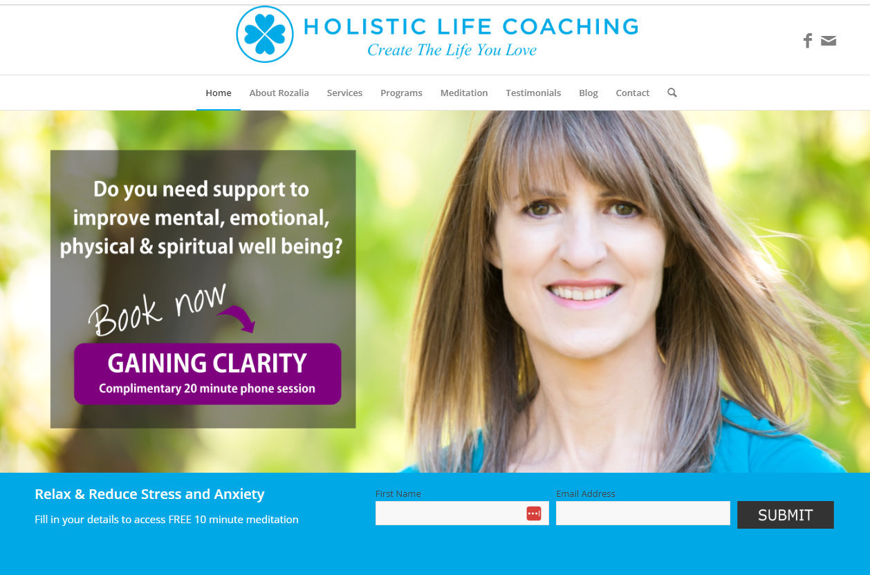
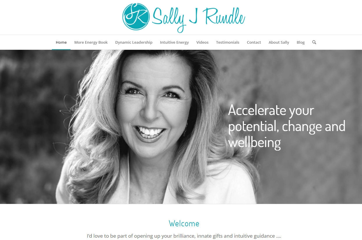
- Front and Center Placement: Place your value proposition prominently on your homepage, ideally above the fold, where it’s immediately visible to visitors.
- Complement with Visuals: Pair your value proposition with compelling visuals, such as a hero image or video, that reinforce your message and capture attention.
Examples of Effective Value Propositions:
| Industry/Niche | Value Proposition | Target Audience | Unique Selling Point (USP) |
|---|---|---|---|
| Life Coaching | Transform Your Life with Personalized Coaching | Individuals seeking personal growth | Tailored coaching plans for unique personal goals |
| Business Coaching | Accelerate Your Business Success | Entrepreneurs and small business owners | Proven strategies to boost business growth |
| Health & Wellness | Achieve Optimal Health with Expert Guidance | Health-conscious individuals | Holistic approach combining nutrition and fitness |
| Career Coaching | Land Your Dream Job with Our Career Coaching | Job seekers and career changers | Personalized career path planning and resume building |
| Financial Coaching | Master Your Finances and Build Wealth | Individuals seeking financial independence | Step-by-step financial planning and investment advice |
| Relationship Coaching | Build Stronger, Healthier Relationships | Couples and individuals | Evidence-based techniques for relationship improvement |
| Executive Coaching | Lead with Confidence and Clarity | Corporate leaders and executives | Leadership development with a focus on emotional intelligence |
Testing and Refining Your Value Proposition:
- A/B Testing: Experiment with different versions of your value proposition to see which resonates best with your audience. Test variations in wording, length, and placement.
- Gather Feedback: Solicit feedback from clients and peers to ensure your value proposition accurately reflects your brand and resonates with your target audience.
Integrating Your Value Proposition Across Your Website:
- Consistent Messaging: Ensure your value proposition is consistently reflected throughout your website, from headlines to CTAs, reinforcing your brand message.
- Support with Testimonials: Use client testimonials and success stories to back up your value proposition, providing social proof of your claims.
By crafting a clear and compelling value proposition, you effectively communicate the unique benefits of your coaching services, capturing the attention of potential clients and encouraging them to explore further.
Learn more: “How to Write a Coaching Bio that Sells”
User-Friendly Navigation
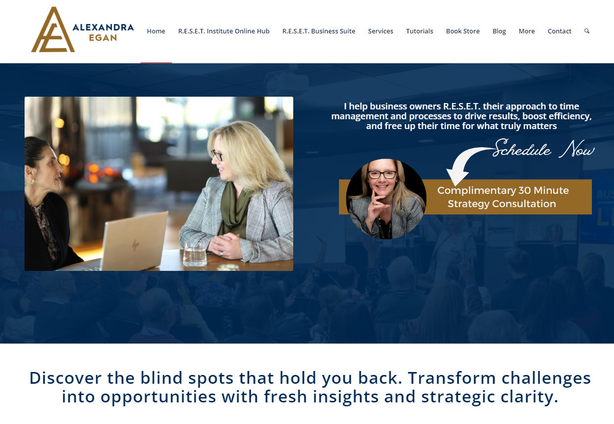
Imagine walking into a store where everything is scattered. Frustrating, right? Your website’s navigation should be the opposite—clear and intuitive. Use simple labels like “About,” “Services,” and “Contact” to guide visitors effortlessly. And don’t forget to test it out yourself; if you can’t find what you’re looking for, neither can they.
Here’s how to create an effective navigation structure:
Designing a Clear Navigation Menu:
- Logical Structure: Organize your navigation menu in a logical order that reflects the visitor’s journey. Start with broad categories like “Home” and “About,” followed by specific sections like “Services,” “Testimonials,” and “Contact.”
- Descriptive Labels: Use clear, descriptive labels for each menu item. Avoid jargon or vague terms; instead, use straightforward language that visitors will immediately understand.
- Consistent Placement: Position your navigation menu consistently across all pages, typically at the top of the page. This consistency helps visitors know where to look, regardless of which page they’re on.
Prioritizing Key Pages:
- Highlight Important Sections: Ensure that the most important pages, such as “Services” and “Contact,” are easily accessible from the main menu. These are often the pages visitors will seek out first.
- Dropdown Menus: Use dropdown menus sparingly to organize subcategories without cluttering the main navigation. For example, under “Services,” you might include specific offerings like “Career Coaching” and “Life Coaching.”
Enhancing User Experience:
- Responsive Design: Ensure your navigation menu is responsive and works seamlessly on all devices, including mobile phones and tablets. A mobile-friendly menu often uses a “hamburger” icon to save space.
- Search Functionality: Consider adding a search bar to help visitors quickly find specific content. This is especially useful for larger websites with extensive resources or blog posts.
Using Heatmap Tools for Optimization:
- Heatmap Analysis: Utilize heatmap tools like Hotjar or Crazy Egg to visualize where visitors click most often on your site. This data helps you understand user behavior and identify popular or overlooked areas.
- Adjusting Navigation Based on Data: Use insights from heatmaps to adjust your navigation menu. If certain pages receive more clicks, consider making them more prominent in the menu. Conversely, if some links are rarely clicked, evaluate their necessity or visibility.
Examples of Effective Navigation:
- Minimalist Approach: A simple navigation menu with 4-6 main items can reduce cognitive load and make it easier for visitors to find what they need.
- Sticky Navigation: Implement a sticky menu that remains visible as users scroll down the page, providing constant access to navigation options.
Testing and Iteration:
- User Testing: Conduct user testing sessions to gather feedback on your navigation structure. Observe how real users interact with your site and make adjustments based on their experiences.
- Continuous Improvement: Regularly review your navigation menu and make iterative improvements based on user feedback and analytics data.
By designing a user-friendly navigation menu, you create a seamless experience that guides visitors through your website effortlessly. This not only enhances user satisfaction but also increases the likelihood of conversions as visitors can easily access the information they need.
Mobile Responsiveness
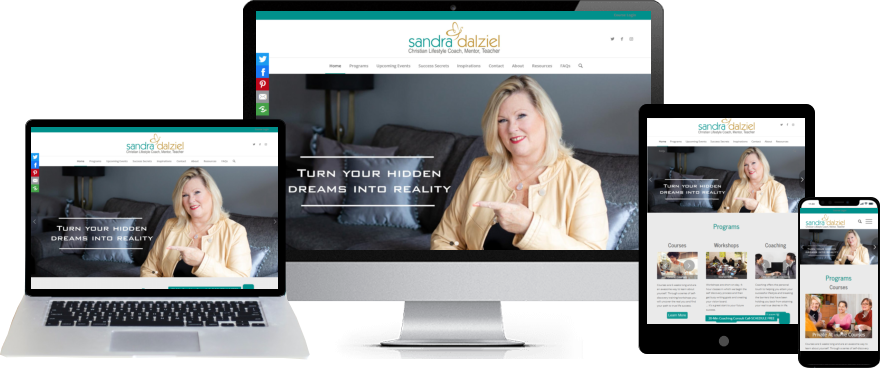
We’ve all been there—trying to navigate a website on our phones, only to find it’s a jumbled mess. With so many people browsing on mobile, your site needs to look just as good on a phone as it does on a desktop. Tools like Google’s Mobile-Friendly Test can help you ensure everything’s in tip-top shape.
Here’s how to ensure your website is fully responsive:
Understanding Mobile Responsiveness:
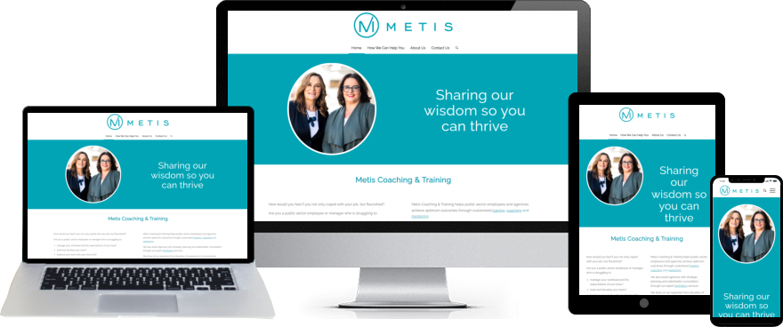
- Definition: Mobile responsiveness means your website automatically adjusts its layout and content to fit different screen sizes, from desktops to smartphones and tablets. This ensures that all users have a consistent and enjoyable experience, regardless of the device they use. Mobile design is also one of the most essential website features for coaches to maintain engagement and boost conversions.
- Importance: A responsive design prevents issues like horizontal scrolling, tiny text, and misaligned images, which can frustrate users and lead to high bounce rates.
Key Elements of a Mobile-Friendly Design:
- Flexible Layouts: Use flexible grid layouts that adapt to various screen sizes. This ensures that elements like text, images, and buttons resize and reposition themselves appropriately.
- Scalable Images: Implement responsive images that automatically adjust their size based on the device’s screen resolution. This prevents slow loading times and ensures images look sharp on all devices.
- Touch-Friendly Navigation: Design navigation menus and buttons that are easy to tap on smaller screens. Ensure there’s enough space between clickable elements to avoid accidental clicks.
Testing for Mobile Responsiveness:
- Device Testing: Regularly test your website on a variety of devices, including smartphones, tablets, and different operating systems (iOS, Android). This helps identify any issues specific to certain devices.
- Browser Testing: Check your site on multiple browsers (Chrome, Safari, Firefox) to ensure consistent performance across platforms.
- Tools for Testing: Use tools like Google’s Mobile-Friendly Test, BrowserStack, or Responsinator to simulate how your site appears on different devices and identify areas for improvement.
Optimizing for Mobile Performance:
- Fast Loading Times: Optimize your site’s loading speed by compressing images, minimizing code, and leveraging browser caching. Mobile users often have slower internet connections, so speed is critical.
- Readable Text: Ensure text is large enough to read without zooming. Use a legible font size and line spacing to enhance readability on smaller screens.
- Simplified Content: Prioritize essential content and features for mobile users. Avoid clutter and focus on delivering a streamlined experience that highlights key information and CTAs.
Examples of Mobile-Responsive Features:
- Responsive Menus: Implement a “hamburger” menu icon that expands to reveal navigation options, saving space on mobile screens.
- Adaptive Forms: Design forms that are easy to fill out on mobile devices, with larger input fields and touch-friendly buttons.
Continuous Monitoring and Improvement:
- Analytics Insights: Use analytics tools to monitor mobile traffic and user behaviour. Identify any drop-off points or pages with high bounce rates and make necessary adjustments.
- User Feedback: Gather feedback from mobile users to understand their experience and identify areas for enhancement.
By prioritizing mobile responsiveness, you ensure that your coaching website delivers a seamless and engaging experience for all users, regardless of the device they use. This not only improves user satisfaction but also increases the likelihood of conversions as visitors can easily navigate and interact with your site.
Example: Use tools like Google’s Mobile-Friendly Test to check how your site performs on mobile devices and make necessary adjustments.
Strong Call-to-Action (CTA)
Your CTAs are like signposts, guiding visitors to take action. Use phrases like “Book Your Free Consultation” or “Download Your Free Guide” and make them stand out. Experiment with colors and placements to see what catches the eye. Remember, a little A/B testing can go a long way. You can also test higher-converting copy found in our lead generation guide for coaches, ideal for getting visitors to take the next step.
Here’s how to create CTAs that convert:
Crafting Compelling CTAs:
- Action-Oriented Language: Use strong, clear verbs that prompt immediate action. Phrases like “Book Your Free Consultation,” “Get Started Today,” or “Download Your Free Guide” create a sense of urgency and clarity.
- Value Proposition: Clearly communicate the benefit of taking action. For example, “Unlock Your Potential with a Free Coaching Session” highlights the value the visitor will receive.
- Personalization: Tailor your CTAs to resonate with your target audience. Use language that speaks directly to their needs and desires, such as “Transform Your Career with Expert Guidance.”
Designing CTAs for Visibility:
- Prominent Placement: Position your CTAs where they are easily visible, such as at the top of the page, within the main content, and at the end of blog posts. Ensure they stand out without being intrusive.
- Contrasting Colors: Use colors that contrast with your website’s color scheme to make CTAs pop. For instance, if your site is primarily blue, a bright orange or green button can draw attention.
- Consistent Style: Maintain a consistent style for all CTAs to create a cohesive look. Use the same font, button shape, and design elements across your site.
A/B Testing for Optimization:
- Test Variations: Experiment with different CTA texts, colors, sizes, and placements to see which combinations yield the highest conversion rates. For example, test “Schedule Your Free Call” against “Book Your Free Consultation” to see which performs better.
- Analyze Results: Use tools like Google Optimize or Optimizely to track the performance of each variation. Analyze metrics such as click-through rates and conversion rates to determine the most effective CTAs.
- Iterate and Improve: Based on the data, refine your CTAs to enhance their effectiveness. Continuous testing and optimization ensure your CTAs remain aligned with your audience’s preferences.
Examples of Effective CTAs:
- “Start Your Journey Today”: Ideal for encouraging visitors to take the first step in their coaching journey.
- “Claim Your Free Strategy Session”: Offers a tangible benefit and creates a sense of exclusivity.
- “Download Your Success Blueprint”: Appeals to visitors looking for actionable resources.
Integrating CTAs Seamlessly:
- Contextual Relevance: Ensure CTAs are relevant to the content they accompany. For example, a CTA for a free consultation should follow a section discussing the benefits of personalized coaching.
- Multiple Touchpoints: Include CTAs at various points throughout your website to capture visitors at different stages of their journey. This could be on the homepage, within blog posts, and on dedicated landing pages.

Engaging Content
Content is king, but engagement is queen. Use storytelling to connect with your audience on an emotional level. Share success stories, offer valuable insights, and don’t shy away from using visuals like videos or infographics. Your content should be a reflection of your brand’s personality.
Here’s how to create content that captivates your audience:
Understanding Your Audience:
- Identify Pain Points and Desires: Research your target audience to understand their challenges, goals, and motivations. Tailor your content to address these specific needs and offer solutions.
- Speak Their Language: Use language and terminology that resonates with your audience. This creates a connection and shows that you understand their world.
Storytelling to Connect Emotionally:
- Craft Compelling Narratives: Use storytelling to create an emotional connection with your audience. Share relatable stories that illustrate the transformation your coaching provides.
- Highlight Client Journeys: Share success stories of past clients, highlighting their journey and the results they achieved through your coaching. This not only demonstrates your expertise but also provides social proof. To create powerful copy, you can also explore tips in our article on transforming your coaching website content.
Incorporating Visuals for Enhanced Engagement:
- Use High-Quality Images: Include professional images that reflect your brand and resonate with your audience. Visuals can break up text and make your content more appealing.
- Create Infographics: Use infographics to present complex information in an easily digestible format. This is particularly effective for sharing statistics, processes, or step-by-step guides.
- Leverage Video Content: Incorporate videos to engage visitors and convey your message more dynamically. Consider creating introductory videos, client testimonials, or coaching session previews.
Providing Valuable and Actionable Insights:
- Educational Content: Offer valuable insights and tips that help your audience solve their problems or achieve their goals. This positions you as an authority in your field.
- Actionable Guides: Create step-by-step guides or checklists that provide practical advice. This not only adds value but also encourages visitors to take action.
Optimizing Content for Readability:
- Use Clear Headings and Subheadings: Break up content with clear headings and subheadings to guide readers through your page. This improves readability and helps visitors find the information they need quickly.
- Keep Paragraphs Concise: Use short paragraphs and bullet points to make your content easy to scan. This is especially important for mobile users who may be reading on smaller screens.
Encouraging Interaction and Engagement:
- Include Calls to Action: Encourage visitors to engage with your content by including clear calls to action. This could be signing up for a newsletter, downloading a resource, or booking a consultation.
- Invite Comments and Feedback: Encourage visitors to leave comments or feedback on your blog posts or articles. This fosters a sense of community and engagement.
Examples of Engaging Content:
- Blog Posts: Write informative and inspiring blog posts that address common challenges faced by your audience. Use storytelling and real-life examples to illustrate your points.
- Case Studies: Develop detailed case studies that showcase the transformation your clients have experienced. Highlight the challenges they faced, the solutions you provided, and the results achieved.
By creating engaging content that resonates with your audience, you not only attract visitors but also build trust and credibility, encouraging them to explore further and take action.

Schedule a Free Website Strategy Session
Take the First Step Towards a More Effective Website. Schedule Your Strategy Session Today!
Trust-Building Elements
Trust is the foundation of any coaching relationship. Display client testimonials, certifications, and secure website indicators prominently. A testimonial from a satisfied client can be the nudge a potential client needs to reach out.
Here’s how to integrate trust-building elements into your website:
Client Testimonials:
- Collect Authentic Testimonials: Reach out to past clients and ask for testimonials that highlight their positive experiences and the results they achieved through your coaching. Encourage them to be specific about the benefits they received.
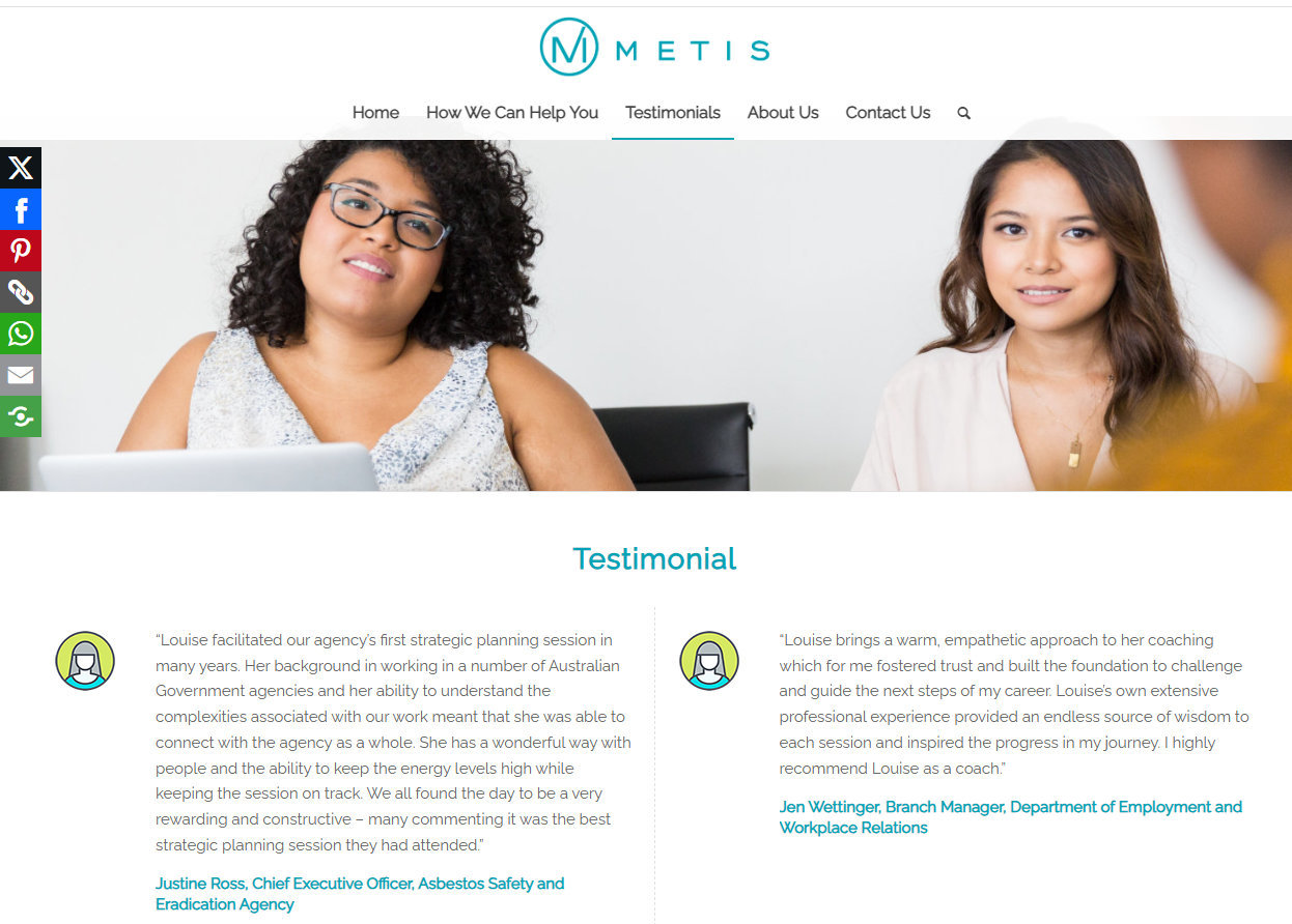
- Display Prominently: Feature testimonials on your homepage to immediately establish credibility. Use a slider or carousel format to showcase multiple testimonials without overwhelming the page.
- Dedicated Testimonials Page: Create a dedicated page for detailed client success stories. Include longer testimonials, client photos (with permission), and even video testimonials for a more personal touch.
Professional Certifications and Affiliations:
- Highlight Credentials: Display your professional certifications, qualifications, and affiliations with reputable organizations. This reassures visitors of your expertise and commitment to professional standards.
- Use Recognizable Logos: If you’re affiliated with well-known organizations or have received industry awards, display their logos on your site. This provides instant recognition and trust.
Secure Website Indicators:
- SSL Certificate: Ensure your website has an SSL certificate, indicated by “https://” in the URL and a padlock icon in the browser. This signals to visitors that their data is secure and builds trust.
- Privacy Policy: Include a clear privacy policy that outlines how you handle visitor data. This transparency reassures visitors that their information is safe.
Case Studies and Success Stories:
- Detailed Case Studies: Develop case studies that detail the challenges faced by clients, the solutions you provided, and the results achieved. Use these stories to illustrate your coaching process and effectiveness.
- Visual Storytelling: Incorporate visuals such as before-and-after scenarios, graphs, or charts to enhance the storytelling aspect of your case studies.
Social Proof and Reviews:
- Social Media Mentions: Highlight positive mentions or reviews from social media platforms. This shows that others are talking about and endorsing your services.
- Third-Party Reviews: If applicable, link to reviews on third-party platforms like Google My Business or Yelp. These independent reviews add an extra layer of credibility.
Trust Badges and Guarantees:
- Money-Back Guarantee: If you offer a satisfaction or money-back guarantee, prominently display this on your site. It reduces perceived risk and encourages visitors to take action.
- Trust Badges: Use trust badges from secure payment providers or industry associations to reinforce your credibility.
Examples of Trust-Building Elements:
- Video Testimonials: Create short video testimonials where clients share their experiences and results. Video adds a personal touch and can be more persuasive than text alone.
- Client Logos: If you’ve worked with notable clients or companies, display their logos on your site to leverage their brand recognition.
By incorporating these trust-building elements, you create a sense of reliability and professionalism that encourages visitors to engage with your services. Trust is a key factor in the decision-making process, and these elements help bridge the gap between curiosity and commitment.
Lead Capture Forms
Lead capture forms are your ticket to building relationships. Keep them simple and offer something valuable in return, like a free eBook or a discount on the first session.
A pop-up form offering a “Coaching Success Checklist” can be just the incentive visitors need to share their contact details.
A well-placed form combined with high-converting coaching packages can dramatically improve enquiries.
Here’s how to create forms that convert:
Designing Intuitive Forms:
- Keep It Simple: Limit the number of fields to only what is necessary. Typically, asking for a name and email address is sufficient. The simpler the form, the more likely visitors are to complete it.
- Clear Labels and Instructions: Use clear labels for each field and provide brief instructions if needed. This ensures visitors understand what information is required and reduces confusion.
- Responsive Design: Ensure your forms are mobile-friendly and easy to fill out on any device. Use large input fields and buttons to accommodate touchscreens.
Offering Valuable Incentives:
- Free Resources: Offer a free eBook, guide, or checklist in exchange for visitors’ email addresses. Ensure the resource is relevant and provides genuine value to your audience.
- Discounts or Free Sessions: Consider offering a discount on your services or a free introductory session as an incentive. This encourages visitors to take the first step towards becoming a client.
Strategic Placement of Forms:
- Above the Fold: Place forms in prominent locations, such as the top of your homepage or landing pages, where they are immediately visible to visitors.
- Pop-Up Forms: Use pop-up forms strategically to capture attention without being intrusive. Set them to appear after a visitor has spent a certain amount of time on the page or is about to exit.
Creating a Sense of Urgency:
- Limited-Time Offers: Use language that creates a sense of urgency, such as “Limited Time Offer” or “Sign Up Today to Secure Your Spot.” This encourages visitors to act quickly.
- Countdown Timers: Consider adding a countdown timer to emphasize the urgency of the offer. This can increase conversion rates by prompting immediate action.
Examples of Effective Lead Capture Forms:
- Coaching Success Checklist: Offer a free “Coaching Success Checklist” that provides actionable tips and strategies for achieving coaching goals. This positions you as an expert and provides immediate value.
- Webinar Registration: Host a free webinar on a relevant topic and use a registration form to capture leads. This not only builds your email list but also engages potential clients with valuable content.
Testing and Optimization:
- A/B Testing: Experiment with different form designs, placements, and incentives to see which combinations yield the highest conversion rates. Test variations in button colour, form length, and headline text.
- Analyze Performance: Use analytics tools to track form submissions and conversion rates. Analyze the data to identify patterns and areas for improvement.
Integrating with Email Marketing:
- Automated Follow-Up: Integrate your lead capture forms with an email marketing platform to automate follow-up emails. Send a welcome email with the promised incentive and nurture leads with valuable content.
By designing intuitive lead capture forms and offering compelling incentives, you can effectively grow your email list and nurture potential clients. These forms are a crucial component of your website’s conversion strategy, helping you build relationships and drive business growth.
Learn More: “How to Find New Clients as a Coach: 15 Proven Strategies”
Analytics and Tracking
Think of analytics as your website’s health check-up. Set up Google Analytics to track KPIs and inform your design decisions. Use goals to measure specific actions, like form submissions or bookings. This data is your guide to continuous improvement.
Here’s how to set up and utilize analytics for your coaching website:
Setting Up Google Analytics:
- Create an Account: If you haven’t already, create a Google Analytics account and add your website as a property. This will allow you to track visitor data and access detailed reports.
- Install Tracking Code: Add the Google Analytics tracking code to your website’s header. This code collects data on visitor interactions and sends it to your Analytics account.
Identifying Key Performance Indicators (KPIs):
- Define Your Goals: Determine the specific actions you want visitors to take on your site, such as form submissions, consultation bookings, or resource downloads. These actions will serve as your KPIs.
- Track Visitor Behavior: Monitor metrics like page views, bounce rate, average session duration, and conversion rate to understand how visitors engage with your site.
Using Goals in Google Analytics:
- Set Up Goals: Use the Goals feature in Google Analytics to track specific actions that align with your business objectives. For example, set up goals to track form submissions, newsletter sign-ups, or completed bookings.
- Measure Success: Analyze goal completions to measure your site’s success in achieving its objectives. This data helps you assess the effectiveness of your CTAs and lead capture forms. Need help interpreting the data? Start by identifying how coaches attract new clients using key metrics and proven strategies.
Analyzing Visitor Behaviour:
- Behaviour Flow Report: Use the Behavior Flow report to visualize the paths visitors take through your site. Identify common drop-off points and pages with high exit rates to pinpoint areas for improvement.
- Audience Insights: Explore the Audience section to learn more about your visitors, including demographics, interests, and devices used. This information helps you tailor your content and design to better meet their needs. And if you’re just getting started, our Corporate Escape Checklist helps you set the right foundation for your coaching brand.
Optimizing Based on Data:
- Identify Trends: Regularly review your analytics data to identify trends and patterns. Look for pages with high bounce rates or low conversion rates and investigate potential causes.
- Test and Iterate: Use A/B testing to experiment with different design elements, CTAs, or content variations. Analyze the results to determine which changes lead to improved performance.
Examples of Analytics-Driven Improvements:
- Improving User Experience: If analytics reveal that visitors frequently exit from a particular page, consider redesigning the page to improve navigation or content clarity.
- Enhancing Conversion Rates: If a specific CTA has a low conversion rate, test different wording, colors, or placements to increase its effectiveness.
Continuous Monitoring and Adjustment:
- Regular Reporting: Set up regular reports to monitor your site’s performance over time. Use these reports to track progress toward your goals and make informed decisions.
- Stay Informed: Keep up with updates and new features in Google Analytics to ensure you’re leveraging the latest tools and capabilities.
By effectively using analytics and tracking, you can gain a deeper understanding of your website’s performance and make data-driven decisions to optimize its effectiveness. This continuous improvement process helps you create a more engaging and conversion-focused experience for your visitors.
Implementation Tips for Coaches
Implementing the essential features of a conversion-oriented website can seem daunting, but with the right approach and tools, you can create a site that effectively engages visitors and drives conversions. Here’s a step-by-step guide to help you get started:
Start with a Clear Plan:
- Define Your Goals: Clearly outline what you want to achieve with your website. Whether it’s increasing consultation bookings or growing your email list, having specific goals will guide your design and content decisions.
- Identify Your Audience: Understand who your target audience is and what they need from your website. Tailor your content and design to address their pain points and desires.
Choose the Right Tools:
- Website Builder: Select a user-friendly website builder like WordPress, Squarespace, or Wix that offers flexibility and customization options. Ensure it supports responsive design and integrates with essential plugins.
- Analytics and SEO Tools: Use tools like Google Analytics for tracking and Yoast SEO for optimizing your content. These tools help you monitor performance and improve visibility.
Design with User Experience in Mind:
- Simplify Navigation: Create a clear and intuitive navigation menu that guides visitors to key pages. Use descriptive labels and avoid cluttering the menu with too many options.
- Optimize for Mobile: Ensure your site is mobile-responsive by testing it on various devices. Use flexible layouts and scalable images to provide a seamless experience.
Create Engaging Content:
- Focus on Value: Develop content that addresses your audience’s needs and provides actionable insights. Use storytelling to connect emotionally and include visuals to enhance engagement.
- Incorporate CTAs: Place clear and compelling CTAs throughout your site to guide visitors towards taking action. Experiment with different placements and designs to see what works best.
Build Trust with Testimonials and Certifications:
- Showcase Success Stories: Highlight client testimonials and success stories to build credibility. Use real names and photos (with permission) to add authenticity.
- Display Certifications: Feature any professional certifications or affiliations prominently on your site to reinforce your expertise.
Capture Leads Effectively:
- Design Simple Forms: Keep lead capture forms short and easy to fill out. Offer incentives like free resources or discounts to encourage sign-ups.
- Use Pop-Ups Wisely: Implement pop-up forms strategically to capture attention without being intrusive. Set them to appear after a visitor has spent time on the page or is about to exit.
Monitor and Optimize Performance:
- Track Key Metrics: Use Google Analytics to monitor visitor behavior and track KPIs. Regularly review your data to identify areas for improvement.
- Test and Iterate: Continuously test different elements of your site, such as CTAs and content, to optimize performance. Use A/B testing to determine what resonates best with your audience.
Avoid Common Pitfalls:
- Overloading Pages: Avoid overwhelming visitors with too much information or too many options. Keep your design clean and focused on key messages.
- Neglecting Mobile Users: Ensure your site is fully optimized for mobile devices, as a significant portion of traffic comes from mobile users.
Your coaching website is more than just an online presence; it’s a powerful tool for attracting and converting potential clients. By implementing the essential features we’ve discussed—such as a clear value proposition, user-friendly navigation, mobile responsiveness, engaging content, and trust-building elements—you can create a website that not only captures attention but also drives meaningful action.
Remember, the key to a successful website is continuous improvement. Regularly review your analytics to understand visitor behavior, test different elements to optimize performance, and stay updated with the latest design and technology trends. This proactive approach ensures your website remains a valuable asset in your coaching business.
As you embark on this journey to enhance your website, keep your audience’s needs at the forefront. Tailor your content and design to address their pain points and desires, and provide a seamless, engaging experience that encourages them to take the next step.
Frequently Asked Questions
What features should a coaching website have to attract clients?
A coaching website should have a clear value proposition, easy navigation, mobile-friendly design, engaging content, strong CTAs, and trust-building elements like testimonials.
What content is most effective for a coaching website?
Effective content includes blog posts, videos, infographics, and case studies that provide value, establish authority, and engage your audience.
How do I improve the conversion rate on my coaching website?
Improve conversion rates by optimizing CTAs, simplifying the user journey, ensuring fast loading times, and offering valuable content that addresses visitor needs.
What is a value proposition, and how do I create one for my coaching website?
A value proposition is a statement that explains how your services solve clients’ problems. Create one by identifying your unique benefits and clearly communicating them on your site.
How do I choose the right CTAs for my coaching website?
Choose CTAs that align with your business goals and audience needs, and test different wording, colours, and placements to see what resonates best.
What should a coaching website include to convert visitors into clients?
A coaching website should clearly explain what you do, show social proof like testimonials or results, and have one main call-to-action such as “Book a discovery call.”
Beyond that, make sure your navigation is simple and mobile-friendly, your pages load quickly, and your copy speaks directly to your ideal client’s challenges and goals. Include high-quality images, an About page that builds personal connection, and resources or blog posts that demonstrate your expertise. Every page should gently guide visitors toward your call-to-action without overwhelming them with options.
 Ivana Katz from Websites 4 Small Business is an award winning web designer who builds websites that build your business. She provides unbeatable web design services to fit your budget.
The end result? Professional, custom-made sites that give your business the extra oomph it needs to stand out from the competition and make an impact.
Whether you’re a brand-new business or an established one ready to improve your digital presence, Ivana makes it easy to get your business online very quickly. Her websites are professional, tailored to fit your budget, and give your business a serious boost.
Download your FREE copy of “Ultimate Website Design Secrets Blackbook – 10 Bulletproof Strategies for Designing an Outrageously Successful Website”


