The Importance of White Space in Web Design + 8 Examples
There are many ways to build a high-performing website for your business. Hiring a skillful and experienced web design team, for starters, is a must.
However, if you want to guarantee that your online presence attracts, delights, and (most importantly) converts your target audience, you must be ready to do more with less.
In most cases, that means being prepared to keep things clean with plenty of white space.
Utilizing too much negative space on your homepage, product, or content pages may seem counterintuitive. After all, it’s equivalent to wasting an opportunity to show more of what makes your solutions great. However, research suggests that websites with lots of white space often outperform their maximalist counterparts.
So, if you’re interested in employing white space on your site to boost performance, here’s everything you can gain by keeping things simple.
Minimalist Design Appeals to Audiences
One of the biggest pros of using white space on your website is that internet users prefer uncomplicated designs to more complex ones.
Research from 2012 conducted by Google discovered that consumers prefer simple and familiar websites that feature low visual complexity and high prototypicality.
More recent studies have backed up these claims, too. A 2023 scientific paper found that high prototypicality doesn’t just boost first impressions but also improves aesthetic appeal, perceived usability, and brand trustworthiness.
So, if you want to appeal to a large target audience or maximize the likeability of your site, why not do it with plenty of white space?
The ETQ homepage is a marvelous example of how negative space can elevate a site’s aesthetic appeal and usability. The lack of too many elements allows the brand to achieve a luxurious feel. More importantly, the clutter-free appearance accentuates the simplicity of the site’s structure, allowing shoppers to find what they need in just a few clicks.

Image source: etq-amsterdam.com
White Space Helps Highlight Key Messages and Conversion Elements
If aesthetic appeal isn’t what you’re looking for (but conversion potential is), you can, again, accomplish your goals by skillfully utilizing white space on your site.
Ultimately, a cluttered website design does communicate a lot. However, with too many elements vying for web visitors’ attention, chances are that most of your messages (and conversion elements) are falling on deaf ears.
So, instead of trying to fit as much as you can on your homepage (or any other area of your site, for that matter), try to employ white space in a way that will draw attention to your value propositions and CTA buttons.
One thing you need to note is that white space doesn’t necessarily have to be white. In fact, you can and should employ colors and visuals optimized to appeal to your target audience. However, try to keep your palette highly focused.
Furthermore, don’t use too many clashing images, as they could prevent you from effectively communicating your solution’s benefits or aspirational appeal.
For a great example of a brand that smartly uses negative space, check out Escort Radar. By reserving its hero section for four pared-down elements (a breathtaking visual, an engaging heading, a special offer banner, and a CTA button), the brand effectively directs web visitors’ attention toward what matters: exploring Escort’s products and making a purchase that helps them solve their pain points.
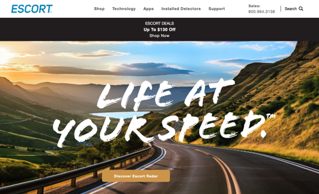
Image source: escortradar.com
Negative Space Aids Readability and Accessibility
Making your website accessible, appealing, and easy to use for your audience is essential for earning their trust and convincing them to convert. Yet, data shows that most businesses aren’t doing so well at making their sites user-friendly.
In its 2024 study, WebAIM found that 95.9% of homepages had accessibility issues, with 81% of those errors relating to text contrast.
So, while incorporating white space into your website’s design may not make up for missing links or alt text, it can make your content easier to consume (and even aid readability and comprehension) — especially when targeting people requiring enhanced accessibility support.
For example, the Main Clinic Supply website targets elderly consumers searching for medical aids. So, instead of going in a modern visual direction that might confuse those with poor eyesight or low computer literacy, the brand utilizes white space and a predictable page layout to make key information as easy to find as possible.
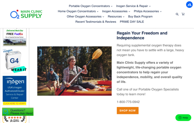
Image source: mainclinicsupply.com
Use White Space to Guide Web Visitors’ Focus to High-Value Content Elements
When designing a website, there are multiple factors you must consider.
In addition to understanding your audience’s visual and UX preferences, you must find effective ways to address their pain points. Plus, to inspire people to convert, you must present them with relevant content that delivers value at the stage of the buyer’s journey these web visitors populate.
Now, the best way to do all this is to conduct in-depth audience behavior research and adapt your web design based on your findings.
Nonetheless, if you want an easy fix that will benefit your prospects and improve the conversion potential of your site, using negative space to guide user focus could be an excellent, budget-friendly design solution.
In web design, negative space is often used to contain content blocks. This aids readability and comprehension and allows consumers to quickly scan small sections of text (or visual content) to find info relevant to their needs.
Another benefit of enhancing your design with white space is that it can signal to web visitors where to look next.
If you look at the Ovaeda homepage, you’ll see that each content blog presents a different decking product. So, instead of forcing consumers to search through an exhaustive navigation menu to find what they need, Ovaeda simply encourages people to scroll. It uses white space to make the headings easily scannable and helps potential buyers quickly discover the solution they need for their homes.
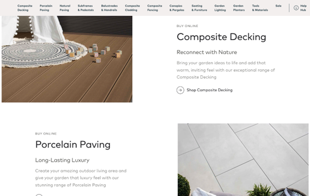
Image source: ovaeda.com
Emphasize Branding and Trust Elements for Improved Brand Perception and Recall
No matter how well-made your website is, converting first-time web visitors is highly unlikely.
Data shows that most consumers need an average of eight brand touches to convert. And research reveals that people prefer buying from brands they know and trust.
With this in mind, the core branding elements and trust signals on your website must stand out. One excellent way to ensure this is to utilize plenty of white space that reinforces your branding strategy.
For example, check out the generous amount of negative space around Drata’s logo at the top of the brand’s homepage. This design choice makes it highly likely that first-time web visitors will notice the visual. Subtly repeating that same logo further down the page allows the brand to boost brand recall. That way, Drata maximizes its chances of re-engaging web visitors who don’t immediately convert with retargeting marketing strategies.
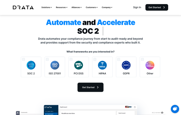
Image source: drata.com
Or, if your main concern isn’t getting your prospects to remember your business but to make them trust your brand, you can do something similar to Qure. This company dedicates almost the entirety of its homepage to establishing its credibility. But, what stands out is that negative space highlights high-value interactive elements that communicate authority, like the section promoting the science-backed benefits of Qure’s products or the one emphasizing the support the brand has received from industry experts.
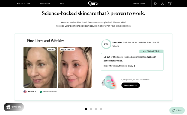
Image source: qureskincare.com
White Space Reduces Cognitive Load and Improves UX
Sometimes, the main conversion obstacle your business faces may not have anything to do with design. Instead, the culprit for a low CR may hide in your site’s (albeit necessary) complexity.
You see, when people have too many options yet feel like they’re not competent enough to make the right decision, they start experiencing decision fatigue. As a result, most of them abandon their carts or procrastinate making a purchase decision.
One excellent way to use white space in your website’s design is to reduce cognitive load and avoid the abovementioned phenomenon.
By decluttering your site’s interface, emphasizing key elements, aiding content comprehension, and improving navigation, white space can hugely decrease your web visitors’ chances of becoming overwhelmed.
And, when paired with a logical, user-friendly layout, it can make even the most complex ecommerce store easy to navigate and use.
For a great example, check out Vitamart. Despite selling thousands of products sorted into dozens of categories, this brand makes browsing and product discovery easy and enjoyable with negative space. Thanks to the pared-down design, buyers can scan a multitude of product categories in a matter of seconds. The lack of visual clutter prevents the site from becoming too chaotic, retaining its minimal, trust-inspiring appearances, which are essential in the health industry.
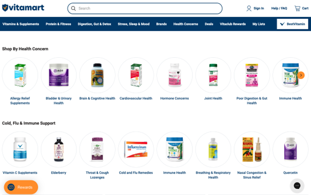
Image source: vitamart.ca
White Space Aids Technical Performance
Finally, as you learn about the importance of negative space in web design, remember that one of the biggest cons of littering your landing pages with tons of content is that it negatively impacts technical performance.
Ultimately, site speed and responsiveness aren’t just nice-to-haves — they’re a requirement in 2024. They impact not only your SERP rankings but also your audience’s willingness to buy from your business.
Research from Google discovered that a 3-second decrease in site speed increases the probability of a bounce by 32%. Even more worryingly, 60% of people abandon online purchases due to poor UX, with 30% of web visitors abandoning a brand’s site if it doesn’t display properly on the device they’re using.
Fortunately, utilizing sufficient white space on your site helps solve both these issues. For one, it reduces the number of page elements, making it easier to optimize your website for fast load times.
More importantly, a good deal of negative space makes it more likely that your website will perform well on small displays. It can help increase the size of your touch targets. It ensures clear text separation. Lastly, white space allows you to create more fluid layouts — like the one used for the Casa Miami homepage — that adapt well to any screen size.
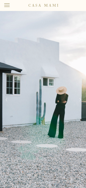
Image source: casamiami.co
Final Thoughts
Enriching your web design with white space is an amazing opportunity to improve site performance. Plus, it can be a key component of earning your audience’s trust by providing a next-level browsing experience.
***
Sarah Kaminski