6 Useful Tips That Will Skyrocket Your Website’s Success
According to Google stats, every month thousands of people search for the keyphrase “Best Website Design”. My guess is those using these keywords are trying to find the best look for their website, but what many people don’t realise is that the graphic design is only a part of having the best website. There are many other things that need to be taken into consideration, when it comes to having a successful website.
1. Website Design, Layout and Navigation
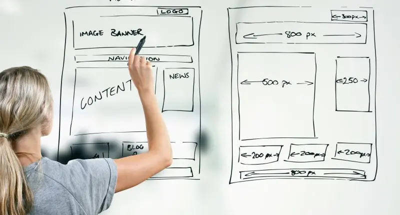
Recent trends in website design and development show that simple is the new black. More and more companies are designing their websites with their customers in mind and rather than overwhelming them with lots of information on the front page, they are keeping things simple. When designing your homepage, choose a few key elements of your website. Then lead your visitors to other parts of your website where they can find more information. This can be done by creating an easy to follow navigation system.
2. Website functionality
When your website designer creates your site, test its functionality, to ensure everything works as it should. Your designer will most likely test your site on various browsers, such as Chrome, Internet Explorer, Safari and Firefox, but people have different versions of browsers and things may sometimes not look quite right and work properly on all of them. It is a good idea to test your website every few months just to make sure everything is functioning. Technology changes very quickly and what may have been fine yesterday, suddenly stops working.
3. Website responsiveness
With more and more people using their smart phones and tablets to search the internet, it is crucial that your website not only looks good on large monitors, but also on laptops and mobile devices. If visitors find it too difficult to navigate and use your website, they will click away and possibly go to your competitor.
4. Website content
Website content is still the king. Don’t get too hung up on the colour of your navigation bar or finding the perfect images. Instead focus on providing your visitors with great content – give them all the information they may need about your products or services to be able to make an informed decision.
5. Call to action
One of the biggest mistakes I see people making is forgetting to include call to action on their homepage. When visitors arrive at the website, they are not really sure where to go, so it’s important you tell them. Do you want them to call you? Provide your phone number in large letters. Do you want them to download a report? Highlight how. Remember over 90% of people won’t buy from you on their first visit, so it is important that you find a way to keep in touch with them and then provide them with useful information on a regular basis, so that when they are ready to buy, you are on top of their list. You can do this by getting them to subscribe to a newsletter or to follow you on one of the many social networks.
6. Search Engines
In your quest to achieve the best website design, don’t just focus on your customers, but also give the search engines what they need. Include relevant keywords in the titles of your pages, within the URL of each page, in meta tags including description and keywords, in image alt tags, within the navigation or breadcrumbs of your website, in headings and also within the content of each page. Also include a sitemap, so that your website can be easily indexed by search engines. Having the best website design is not just about how the website looks, but also how it functions and what information it provides for customers and search engines. If you cover all these basis, your website is likely to be a successful one. **** by Ivana Katz Websites 4 Small Business – www.web4business.com.au

