How to Improve the Design of Your Internal Web Pages
As a website owner, you understand the importance of a great design. A well-designed website can help you attract and retain customers, increase brand recognition, and improve your website’s usability.
However, many website owners focus on the design of their homepage and forget about the importance of designing internal pages. In this article, we’ll provide tips on how to improve the design of your internal pages to help you achieve your business goals.
Analyzing Your Current Design
Before making any changes to your website’s design, it’s important to understand your current design.
Analyzing your current internal page design is a crucial step in improving your website’s overall design. It can help you identify areas for improvement, determine what’s working and what’s not, and provide a starting point for your redesign. Here are some specific examples of how you can analyze your current internal page design:
Use Google Analytics which can provide you with valuable insights into your website’s performance. You can use it to track user behavior, monitor page load times, and identify important pages with high bounce rates. By analyzing this data, you can identify which pages need the most attention and prioritize your redesign efforts accordingly.
Conduct a content audit to determine what’s working and what’s not. You can use tools such as SEMrush or Screaming Frog to crawl your website and identify pages with thin content, duplicate content, or outdated content. By removing or updating these pages, you can improve the user experience and make your website more valuable to your readers.
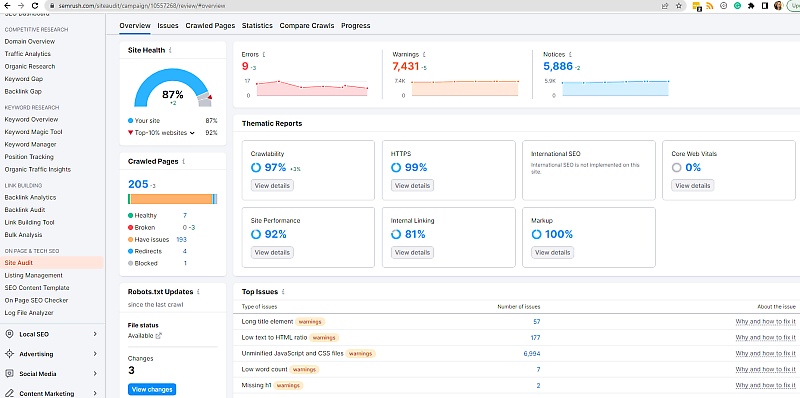
Check for consistency across your internal pages, and ensure that your font, color scheme, and navigation appears the same across all of your pages.
Having real users test your website to identify areas for improvement. You can use tools such as UserTesting or Hotjar to conduct the tests. By watching users interact with your website, you can identify where users are getting stuck.
Analyze competitor websites to see what’s working for them. Look for websites in your industry that have a similar target audience and analyze their design, content, and usability. By identifying what your competitors are doing well, you can incorporate those elements into your own website design.
Identifying User Needs
Once you have a better understanding of your website’s design, it’s time to identify your user’s needs.
Understanding your user’s needs and behaviour can help you create a more user-friendly website. Conducting user research is an effective way to identify pain points and areas for improvement.
You can use tools such as surveys, feedback forms, and user interviews to gather feedback from your users.
Here are some examples of survey or interview questions that can help you identify user needs:
- What is the main purpose of visiting our website?
- What features or functionalities would you like to see on our website?
- How easy or difficult is it to find what you’re looking for on our website?
- What frustrates you the most about our website?
- What other websites do you use that provide a similar service or product?
- How often do you visit our website and why?
- Have you recommended our website to others? If so, why?
- What improvements do you suggest for our website?
- How important is mobile responsiveness to you when using our website?
- Do you find our website visually appealing?
Best Practices for Designing Internal Pages
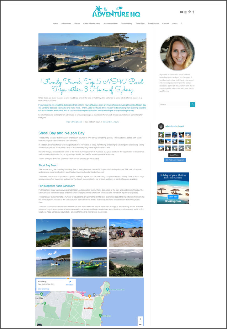
Consistency is key when designing internal pages. You want your website to have a consistent look and feel, so users can easily navigate your website. Here are a few things to keep in mind, when updating your website
- Use the same navigation elements throughout the website, such as menus, breadcrumbs, and links.
- Keep the layout similar on all pages, such as the placement of the logo, header, footer, and content.
- Use the same fonts and font sizes on all pages to maintain consistency in the website’s overall visual style.
- Use the same color scheme throughout the website
- Use high quality graphic and image types across all pages, including size, format, and style.
- Use consistent text formatting, such as headings, subheadings, and paragraph styles.
- Use similar content structure across all pages, such as the use of bullet points, lists, and tables
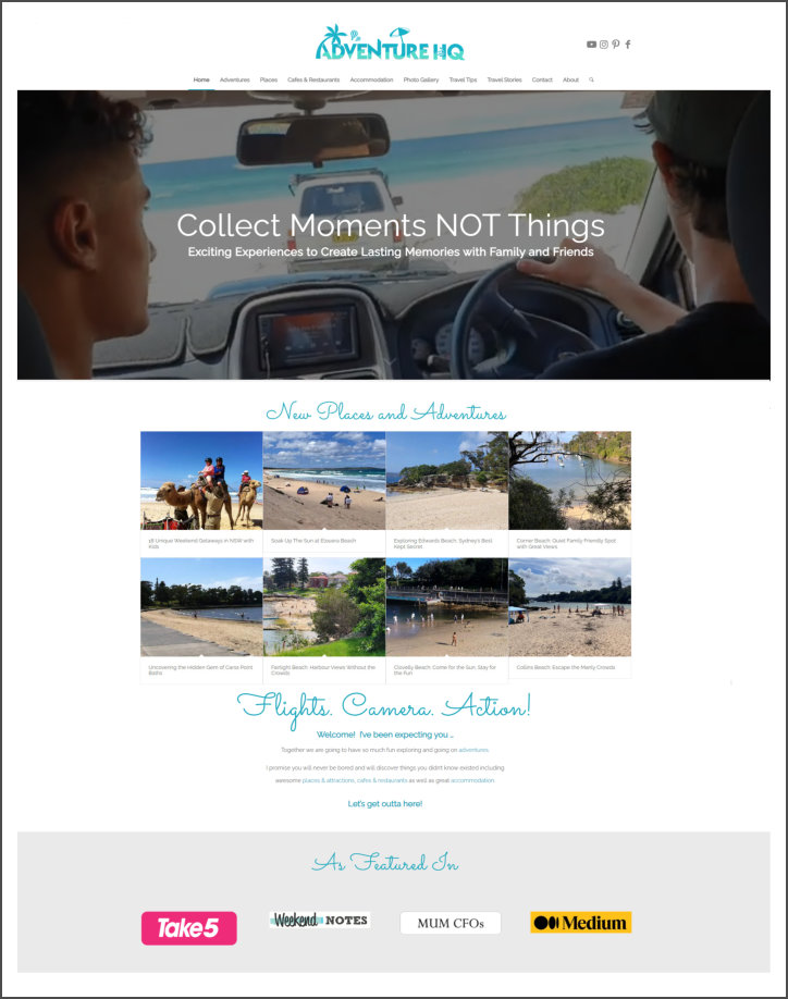
Example of Homepage Design
Example of Consistent Internal Web Page Layout
Creating Engaging Content
The content on your website is just as important as the design. To make the content of your internal web pages engaging:
- Use eye-catching images, videos, infographics,
- Write catchy headlines that grab the reader’s attention and make them want to read more.
- Use storytelling techniques to engage readers and make them emotionally invested in the content.
- Use short paragraphs, subheadings, and bullet points to break up the content
- Use real-life examples, case studies, and testimonials to make your content relatable and compelling.
- Use humor to make your content more enjoyable to read.
- Use quizzes, polls, surveys, and other interactive elements to encourage reader participation.
- Provide actionable tips and advice that readers can use to solve a problem or improve their lives in some way.
Using Call-to-Actions (CTAs)
A call-to-action (CTA) is a button or link that encourages users to take a specific action such as signing up for a newsletter or making a purchase.
Effective CTAs can help increase conversions and achieve your business goals. When designing CTAs, it’s important to use contrasting colors and position them in a prominent location on your website.
Choose some of these calls to action for your website.
Internal Linking
While you are updating the design of your internal pages, it’s a good idea to also do some internal linking.
Linking between pages on your website is a pretty important aspect of website optimization that can help make your website more user-friendly and visible to search engines.
By linking to relevant pages on your site, you can help guide users to the content they are looking for more easily. This can make their experience on your website much smoother and enjoyable.
By having internal links pointing to related content, users are more likely to stay on your website for longer periods of time and engage with your content, which reduces the bounce rate of your website.
Internal linking can also help establish your website as an authoritative source of information and help with search engine optimisation using link equity (value and authority passed between web pages through hyperlinks).
Here are some suggestions on how to go about setting up link structure between your pages.
The first step in creating an internal linking strategy is to conduct a content audit of your website. This will help you understand the content you have available and how it is organized.
The best way to conduct an audit is to:
- Collect data on each page of your website, including the URL, page title, meta description, and any other relevant information that you want to analyze. You can use a tool like Screaming Frog or SEMrush to crawl your website and collect this data.
- Evaluate the quality of the content on each page. Consider factors like readability, accuracy, and relevance. Identify pages with low-quality content that need improving or deleting.
- Check how users are engaging with the content on each page. Look at metrics like bounce rate, time on page, and pageviews to identify pages with low engagement.
- Identify keywords that you want to rank for and check how well your current content aligns with those keywords. Look for opportunities to optimize existing content or create new content to target those keywords.
Once you have a good understanding of your website’s content, you can begin identifying relevant pages to link to. This can include pages that cover similar topics, or pages that provide more in-depth information on a particular subject.
Google is a big fan of content clusters, so it’s a good idea to group together pieces of content that relate to each other.
Content Clusters
To create content clusters first choose a broad topic that you want to cover, like “website design.
Create a comprehensive piece of content (also referred to as a pillar post) that provides an overview of the topic, like “Website Design Checklist – 16 Steps to an Awesome WordPress Website.”
Once your main piece is created, add more in-depth articles that relate to the main topic, like:
“Domain Names: Everything You Need to Know” and
“The Most Important 41 Pages to Include On your Website”.
Link your pillar post to your supporting articles, and link your supporting content to each other.
Use relevant keywords in your content and optimize it for search engines. This makes it easier for users to find your content when they search for related topics.
Keep adding new supporting content as needed.
Here’s another example of a content cluster for the topic of “gardening”:
- Core Content: “The Beginner’s Guide to Gardening”
- Supporting Content: “How to Choose the Right Soil for Your Garden”, “10 Easy-to-Grow Plants for Beginners”, “The Benefits of Companion Planting”
- Interlinking: The Beginner’s Guide is linked to each supporting article, and each supporting article is linked to each other.
- Optimization: The content is optimized for search engines by using relevant keywords like “gardening tips” and “beginner’s gardening guide.
- Updating: The supporting content is regularly updated with new tips and advice
Anchor Text
When linking to articles, blog posts, infographics, charts and images within your articles, use relevant anchor text.
If you haven’t heard that term before, anchor text is the text that appears in the hyperlink. It’s important to use descriptive anchor text that accurately reflects the content of the page being linked to. This can help search engines understand the relationship between the linked pages and improve the user experience.
Here is an example of anchor text:
… tips to find the perfect domain name for your business.
The words “domain name for your business” is considered anchor text and they are linked to a document that talks about domain names. Go ahead and click on the link to see how it works.
While internal linking is important, it’s important not to overdo it. Too many links can make your content appear spammy and overwhelming to the user. Instead, focus on linking to the most relevant and valuable pages.
Update your internal links regularly to ensure they are still relevant and providing value to the user. This can include updating anchor text, adding new links, or removing outdated links.
As a website owner, you should regularly check your website, update existing content and test different design elements to ensure your website continues to deliver what your customer needs.
If you are not sure how to design web pages and would like some help, please contact us.
 Ivana Katz from Websites 4 Small Business is an award winning web designer who builds websites that build your business. She provides unbeatable web design services to fit your budget.
The end result? Professional, custom-made sites that give your business the extra oomph it needs to stand out from the competition and make an impact.
Whether you’re a brand-new business or an established one ready to improve your digital presence, Ivana makes it easy to get your business online very quickly. Her websites are professional, tailored to fit your budget, and give your business a serious boost.
Download your FREE copy of “Ultimate Website Design Secrets Blackbook – 10 Bulletproof Strategies for Designing an Outrageously Successful Website”


