of people will stop engaging with a website if the content or layout are unattractive
Source: Sweor
What page content should be on a homepage?
1. Professional Logo
A logo is a visual identity of your business. In many instances, a logo is the first thing that a potential client thinks of when they hear your business name. A professional logo can help you make a great first impression, stand out from your competition and help customers to remember you.
Hire a professional graphic designer to ensure your logo looks good not only in colour but also in black and white, works well online and in print and is able to be scaled without losing quality.
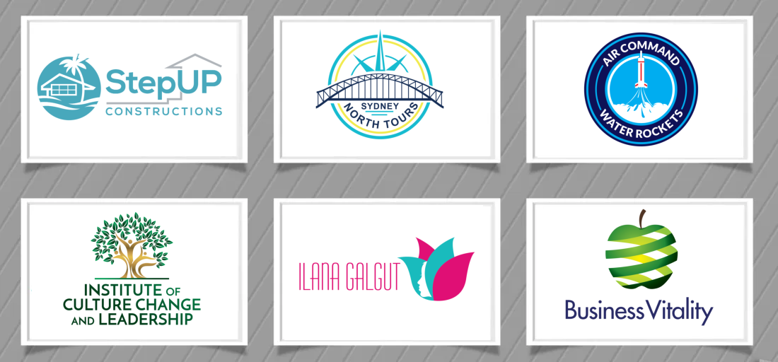
Examples of professional logos.
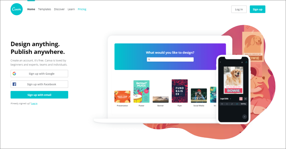
Alternatively, there is the online logo maker option which is fast and cost efficient. Obviously your logo won’t be custom made like using a designer but it’s a good option for small business that are just starting up and that don’t have much budget for branding.
2. Benefit Driven and Easy to Understand Tagline
The minute a customer arrives at your web page, they need to understand what it is that you do and what problems you are going to solve for them. As such, it is important to prominently feature your hook or slogan as part of your page content.
Your tagline should be memorable, straight to the point, differentiate you from your competitors and include a key benefit.
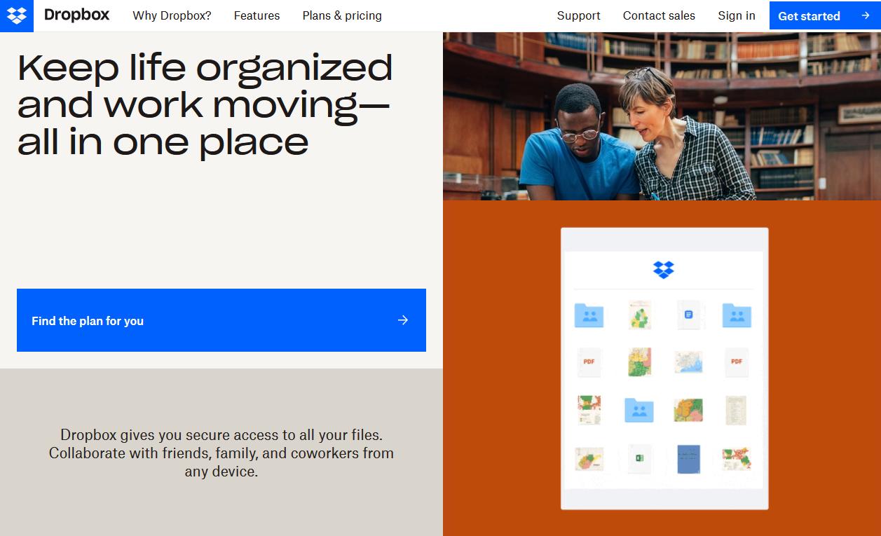
3. Highlight problems your visitor may be experiencing and how you are going to resolve them
Don’t tell your visitors how great your business is, how you use the latest equipment, greatest techniques and offer the best service. No one will believe you.
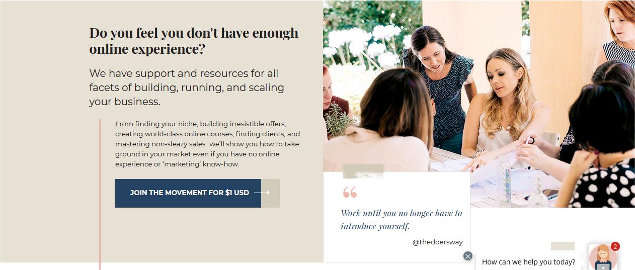
Make your homepage about how your products/services will resolve your customers’ concerns/problems. Show that you understand what they are going through and explain why you are the authority on solving the issues. Explain your process / roadmap you will use to help them.
Instead of using the words “we”, use the words “you”. Write your web content copy as if you were talking to your customer over a cup of coffee.
Information about your products and services should be broken down into bitesize pieces rather than big blocks of text. If you provide too many details, your visitors may become confused or overwhelmed and take no action.
4. Features and Benefits of Your Products and Services
Your homepage should include a brief description of your products and/or services and then lead your customer to individual Services or Product pages for more information.
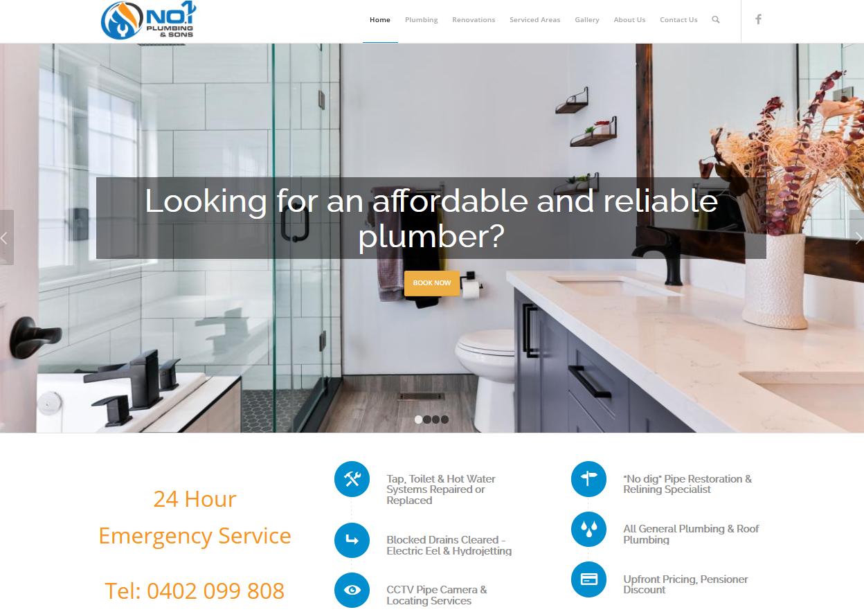
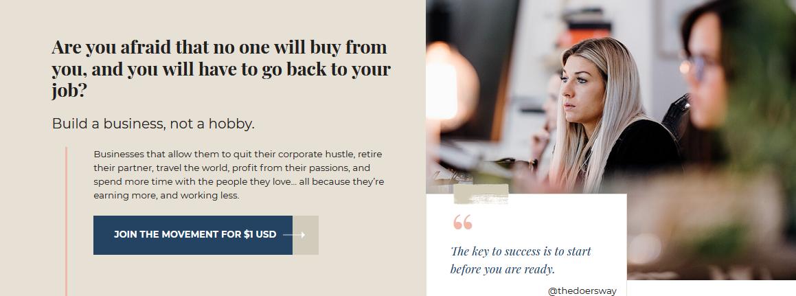
5. Powerful Calls to Action
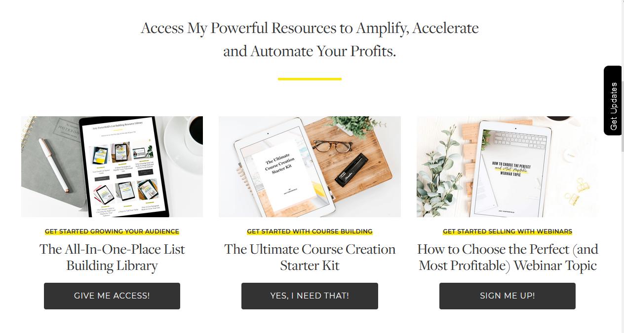
Tell people exactly what you want them to do when they arrive at your website.
Do you want them to:
- contact you
- download a report
- sign up for a webinar
- request a quote
- apply for a consult
- subscribe to your newsletter or
- follow you on social media?
Show them where and how. Include internal links to other relevant pages.
You will need to give your visitors a reason to leave their details, so offer them something that provides value and a possible solution to their problem, eg. a downloadable report with tips, checklists or worksheets, a quiz, a guide, mini training series or a competition.
6. Links to Key Areas of Your Website
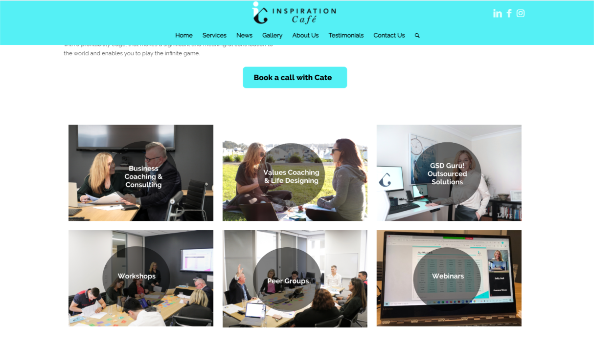
Your visitors will often skim through your homepage looking for information. Don’t overwhelm them with tons of information. Instead, highlight key areas of your website and lead them to other pages, such as your products / services pages, your FAQs page, your contact page, blog etc.
7. Catchy Headlines
You only have a few seconds to get your visitor’s attention, so make sure you include great headlines which will make them want to read more.
8. High Quality Images
Images you use should tell a story of how your products and services solve your customer’s problems and what their life will look like after using your products or services.
Where possible use original images rather than stock photos.
Google loves original content and your business will seem more trustworthy and real if the photos are of you, your products and your staff, rather than staged model images.
9. Engaging Videos
People have short attention span and often prefer to watch videos rather than read pages and pages of text. As such, it is a good idea to include a short video, which gives them an overview of what your website is about and allows them to connect to you on a personal level.
Keep animations to a minimum. Noone is going to wait around until your animation loads and they are certainly not going to sit there and watch it for more than a few seconds.
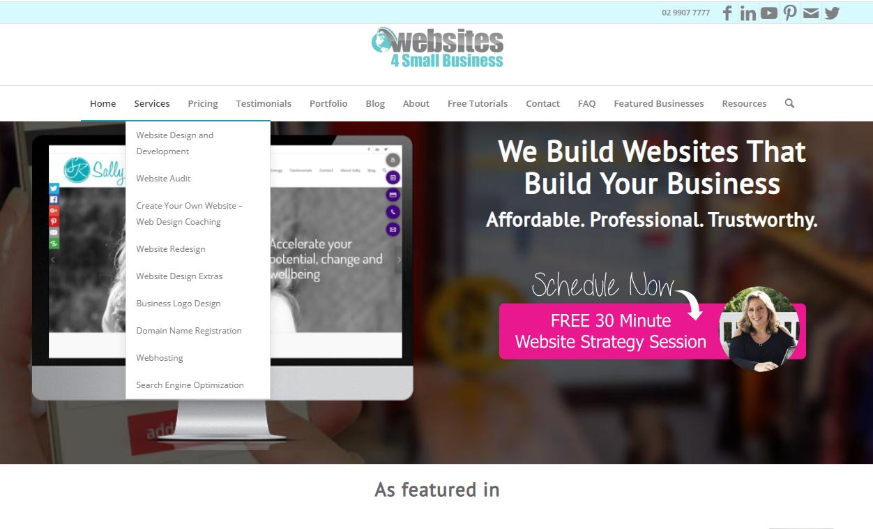
10. Easy to Follow Navigation
Make sure your visitors can easily navigate to other parts of your website by including a simple navigation system – either at the top or left handside.
Another easy way to help your customers navigate through your website is using Flat Icons.
The navigation bar needs to be on all pages. Remember, not everyone will arrive at your website via your homepage.
If your homepage is long, include a “sticky” navigation bar, which stays at the top of the screen as the visitor scrolls down.
11. Links to Social Networks
Include links to all your social networks:
- YouTube
That way your visitors can follow you or check out your social networks to get more information and to ascertain how credible you are.
Make sure you are active on the social networks that you link to. It is better to be very active on one or two networks rather than have 5 setup up and only rarely be posting and sharing on those networks.
You can also include a social media sharing plugin which allows other people to share your content on their websites. You don’t have to be a member of the social networks only your visitors do.
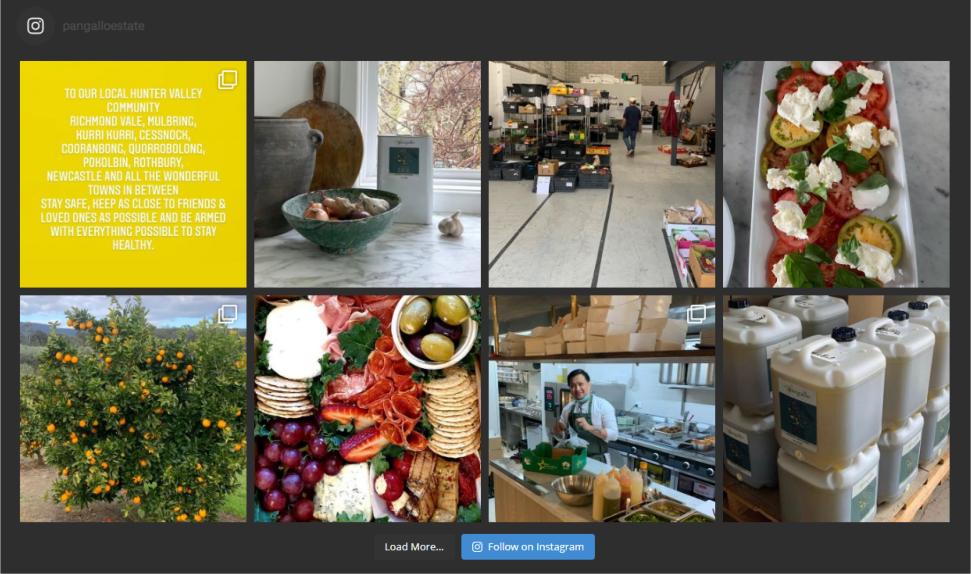
12. Social Network Feed
If you have an Instagram or Facebook account you can display the feed of your posts, articles, images and videos on your website.
This will save you time as anything you post on your social network will automatically display on your website.
13. Trust and Credibility Proof
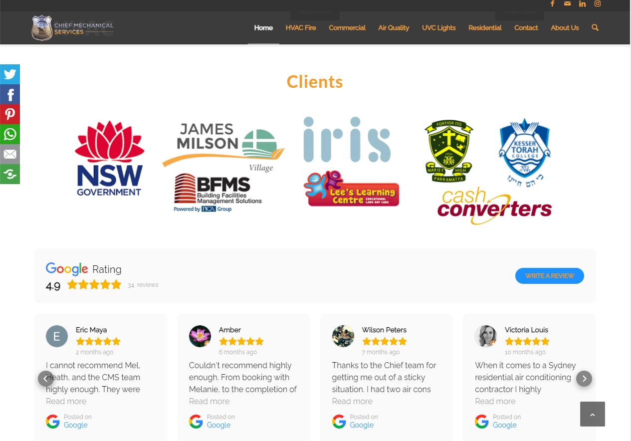
Your website needs to prove to your visitors that you are trustworthy and reliable. This is best done by including testimonials, before & after shots, awards you have won and media articles that have been published about your business or successful case studies of customers you have helped.
Although all these don’t need to be included on the homepage, it is a good idea to have a prominent link or image that takes visitors to pages, where these appear.
You can also add a “As seen in” section on your homepage and highlight some of the publication you have been featured in.
14. Contact Information
Make it easy for customers to contact you and include your contact details:
- phone number,
- email address,
- street or postal address,
- Skype details,
- social media networks
- live chat
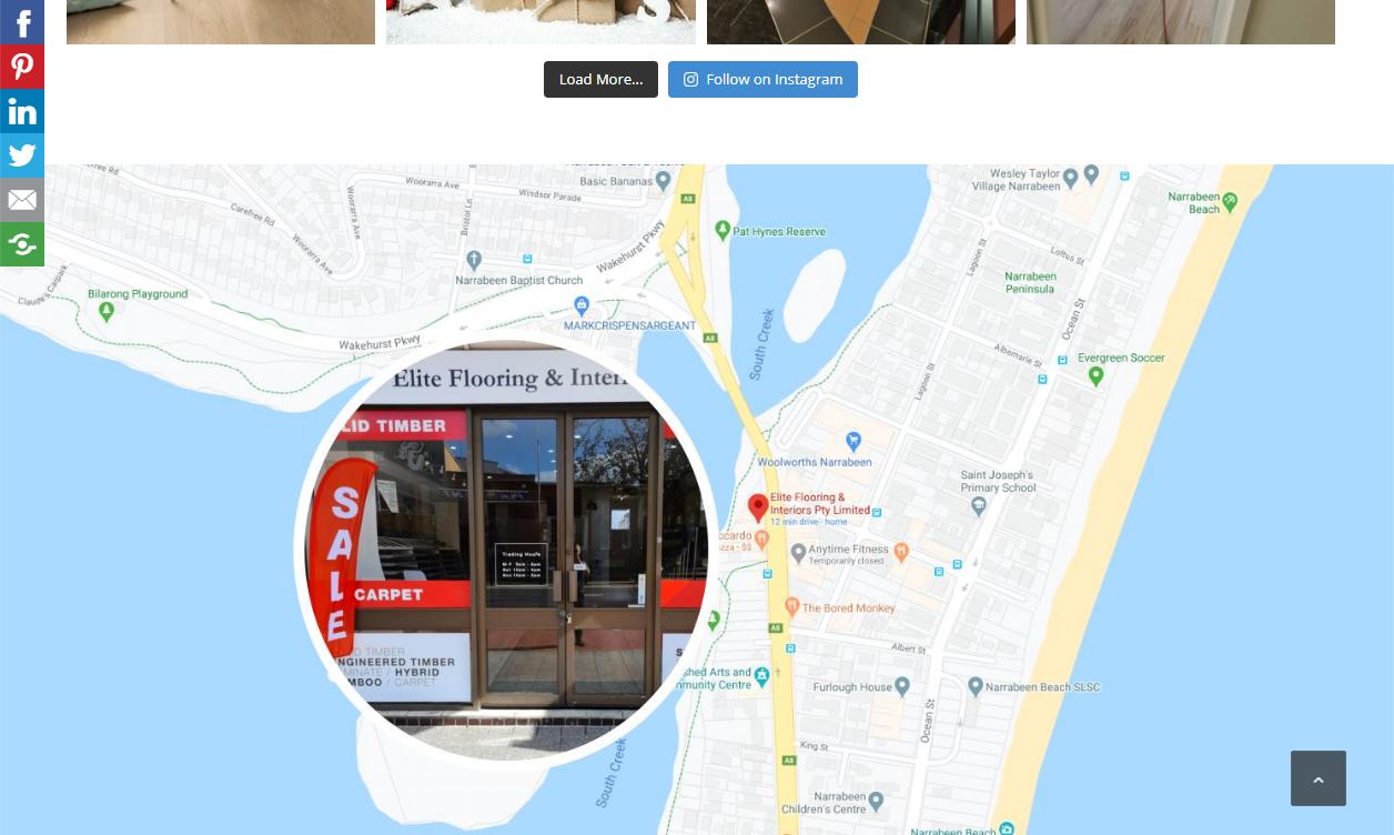
Whenever possible also include a map of where you are located.

15. Directions
Do you have a bricks and mortar store or a real office? Include a Google map and directions to your premises. Other things to include is parking availability and public transport details.
16. Awards and Certifications
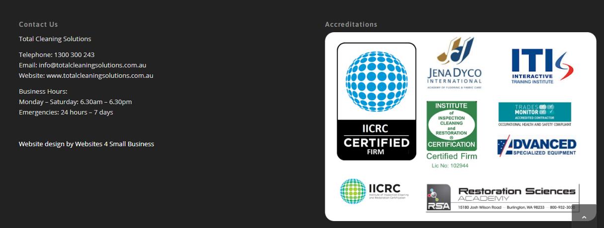
You’ve spent time learning your skills and have your business / product / service / skillset independently evaluated to ensure you comply with specific standards for safety, quality or compliance. Don’t forget to include these certifications on your website
Likewise if you or your company has won any industry awards, make sure you display them on your homepage. These go a long way to proving your credibility.
17. Keywords and Keyphrases
Ensure you include keywords (words people use to search for your products / services) throughout the copy of the website as well as in the headings, title of your page, in the meta tags – description and keywords.
Google has got a lot smarter in reading your website, so you don’t need to repeat the same keyword or keyphrase dozens of times. If you do, you may be penalized for keyword stuffing.
18. Opening Hours
Don’t forget to include your opening hours, even if you work from home, publish business hours when customers can reach you via phone or instant chat.

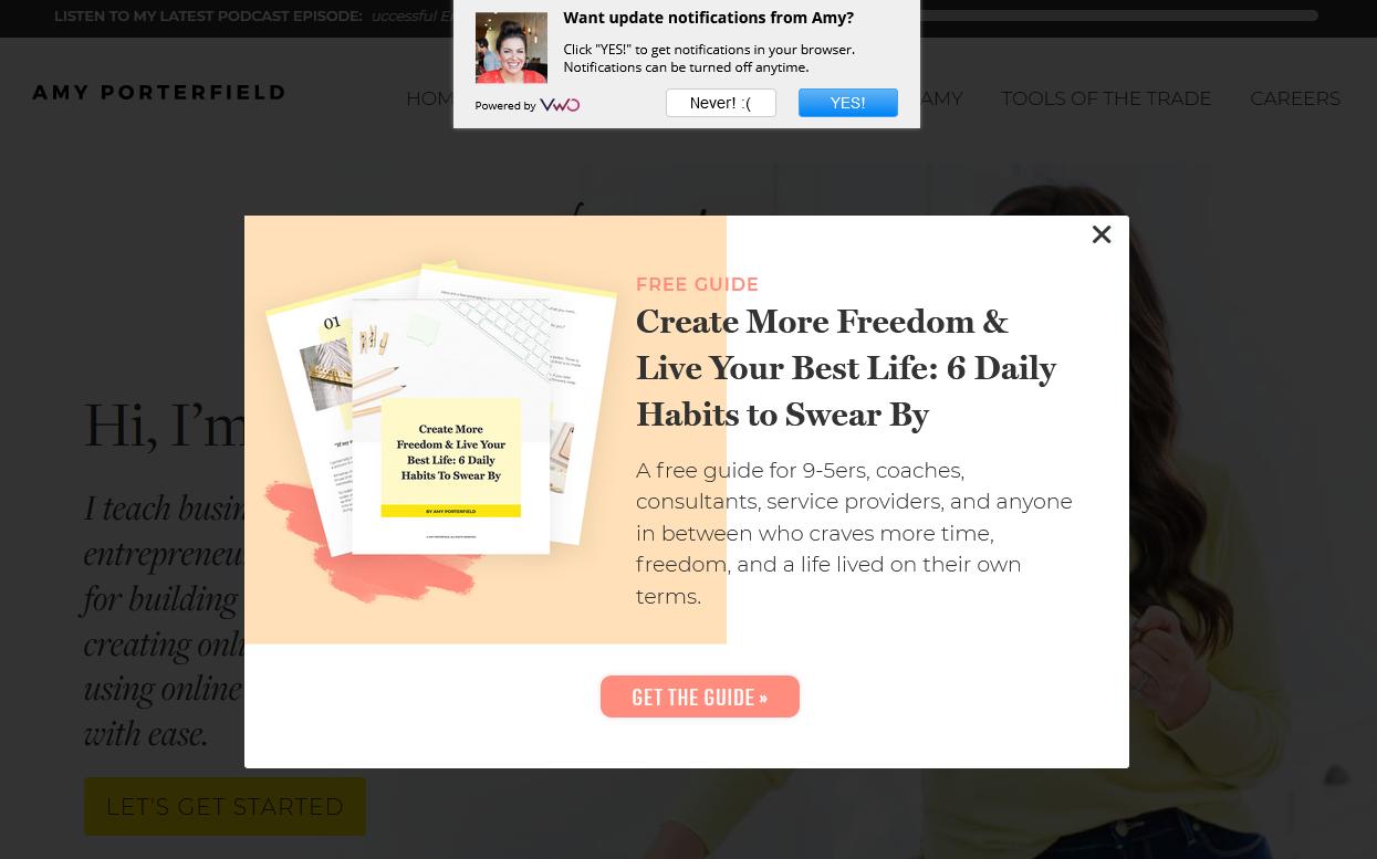
19. Capture Email by Offering Valuable Content
98% of visitors won’t buy from you on the first visit, so it is important you capture their details and then stay in touch to build trust and credibility.
This can be done via a pop-up or inline form linked to your favourite email software such as Mailchimp, GetResponse, AWeber, Active Campaign, Constant Contact, etc.
“Subscribe to our Newsletter” doesn’t work anymore. You will need to give your visitors a reason to leave their details, so offer them something that provides value and a possible solution to their problem, such as:
- a downloadable report with tips
- checklist
- worksheet
- quiz
- guide
- mini training series
- competition
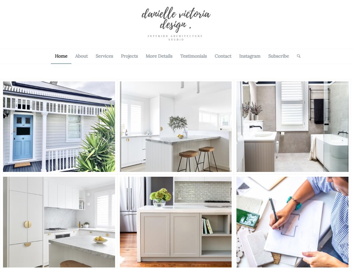
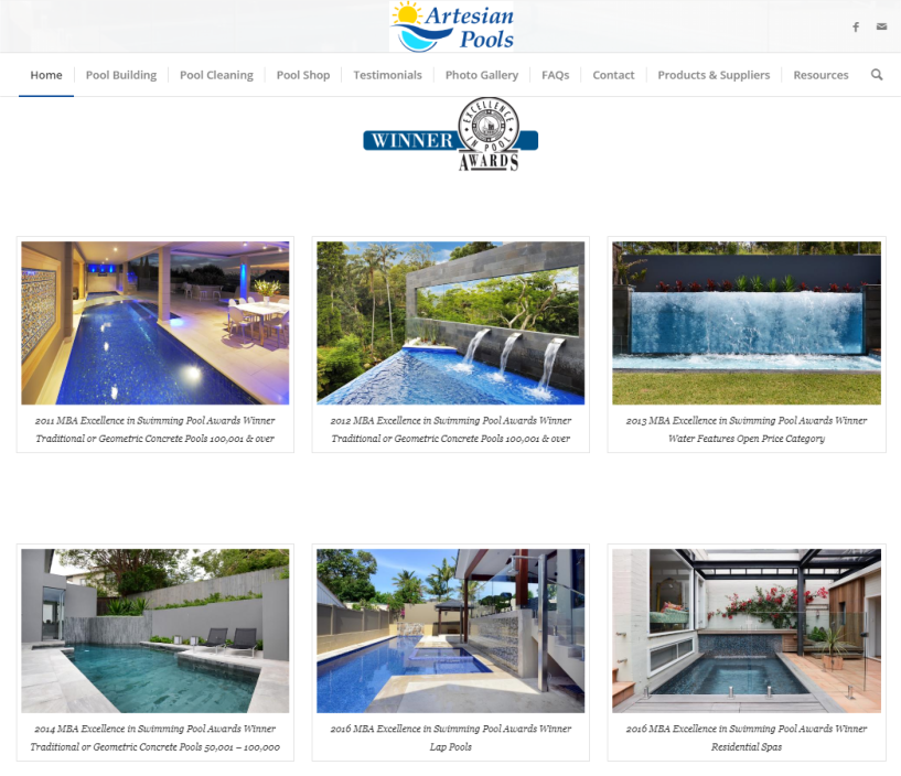
20. Portfolio / Photo Gallery
Showcase your goods or services in a special online portfolio or photo gallery. They say “pictures speak a thousand words” and on your website it is particularly important.
Some examples of photo galleries & portfolios include:
– photographers – photos they have taken,
– marriage celebrants – ceremonies they’ve performed,
– entertainers – photos from their performances,
– interior designers – makeovers they have done
– graphic designers – logos they have created
– cake decorators – special cakes they’ve made and decorate
– business coaches – seminars / workshops they have presented at
The homepage should only display a few photos and direct customers to a dedicated Photo or Portfolio Gallery page.
21. Blog / News Feed
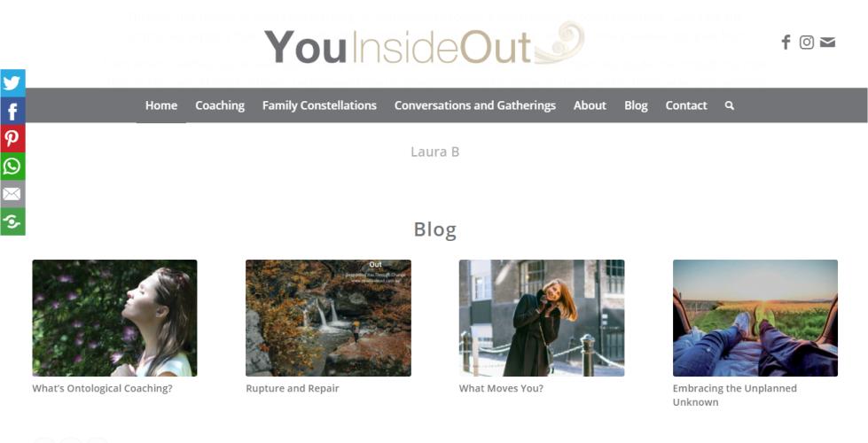
If you have a blog or news section on your website, make sure you include the feed from that on the homepage.
This shows your visitors you are active and regularly post relevant content on your website.
A blog can help drive traffic to your website and convert leads into customers. It also helps with link building and keeping your audience up to date with your company’s news.
22. Brief Bio
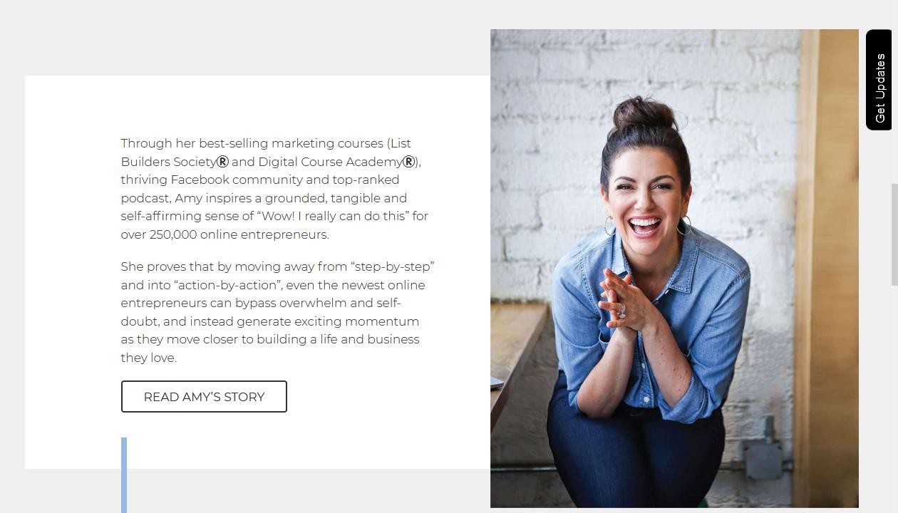
If you have a personal brand, include a brief bio on your homepage, together with your photo or a video. People connect to people, so having your details featured on your homepage quickly shows your visitors who they will be dealing with.
On the homepage, be brief with your information and lead customers to your About us page, which should have further details, photos etc.
23. Special Deal / Offer / Discount
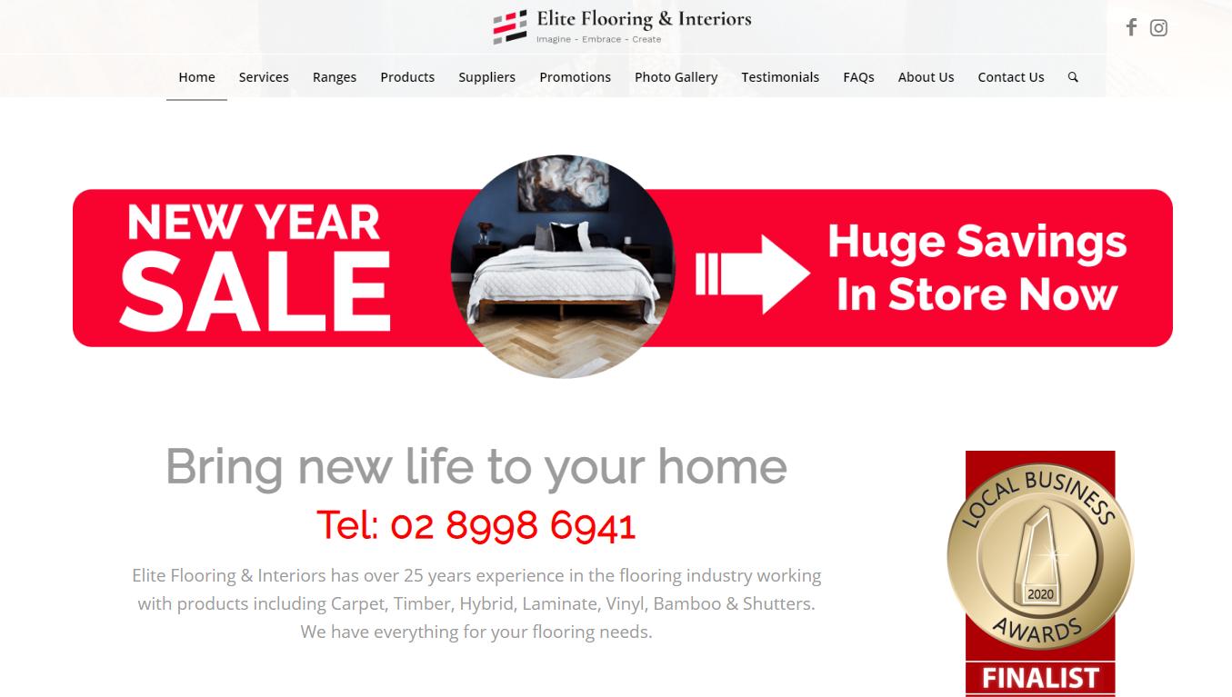
Are you running a special “Christmas”, “Father’s Day”, “Mother’s Day” or EOFY promotion? Feature a banner prominently on your homepage and drive visitors to take the next step. Make sure your offer is quantity or time limited to create a sense of urgency.
24. Search Function
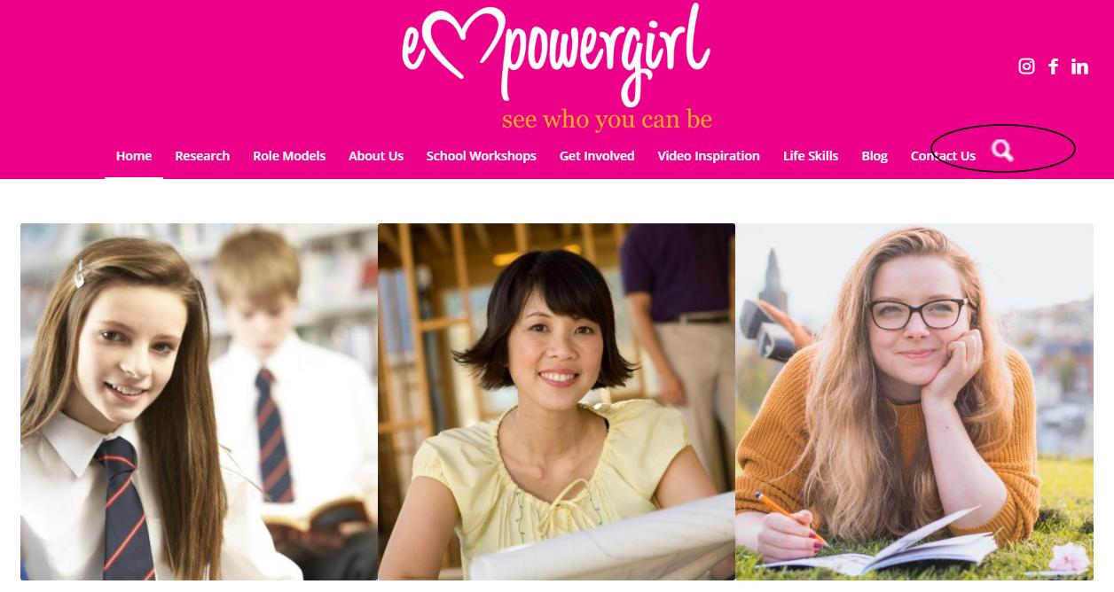
Make it easy for customers to find information on your website by including a search feature. This is usually displayed in the main navigation.
What is an effective home page layout design?
The elements that you include on your homepage greatly depend on the type of business you run and what you are trying to achieve.
Ultimately no one can tell you what the most effective layout for your homepage is – you have to test that with your target audience.
You should test different aspects of your homepage and your website, including:
- Call to Action Buttons
- Navigation Bar
- Login and Sign Up Buttons
- Content
- Offers
- Images
- Headlines
- Hyperlinks
Find out more about running A/B Testing of your homepage
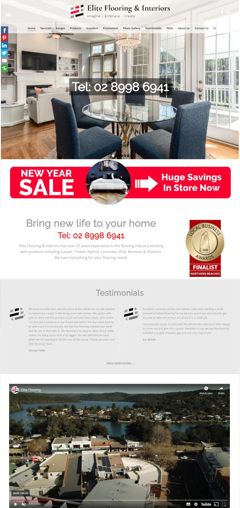
Homepage design examples
Elite Flooring & Interiors
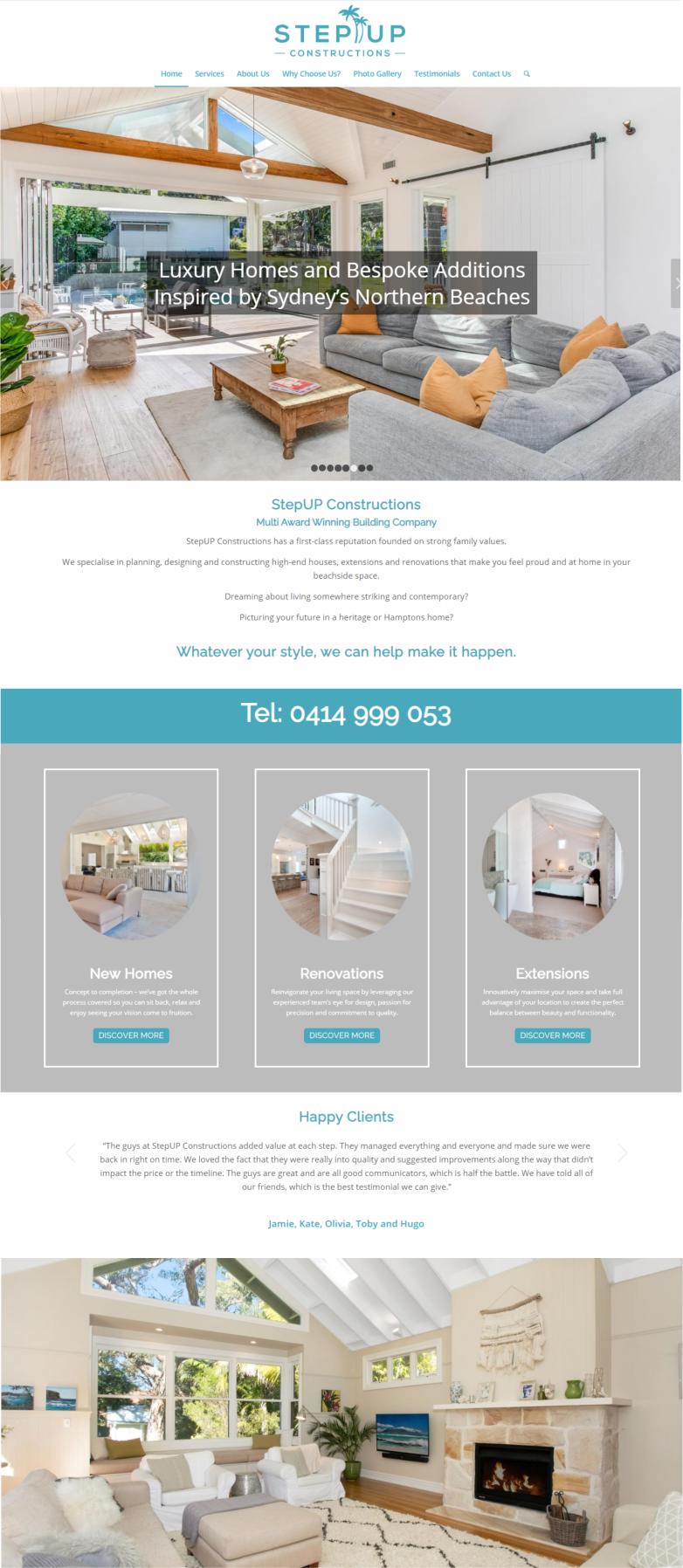
Step-Up Constructions
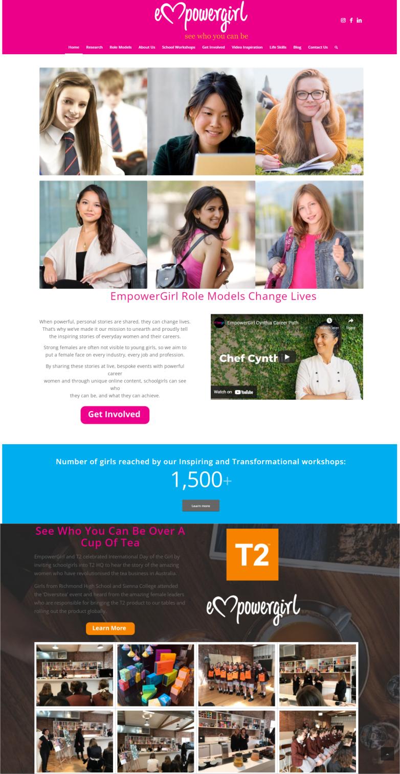
Empower Girl
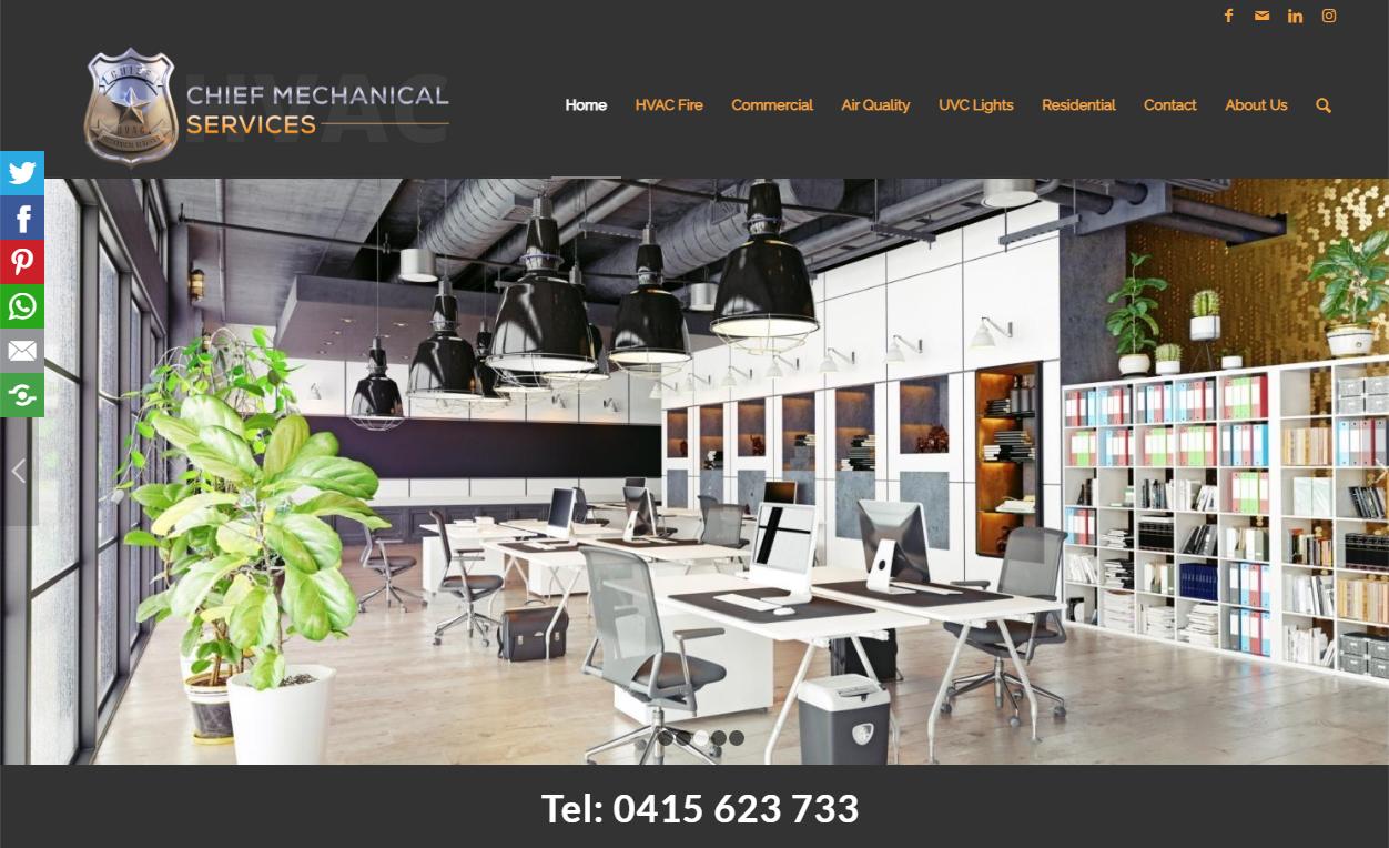
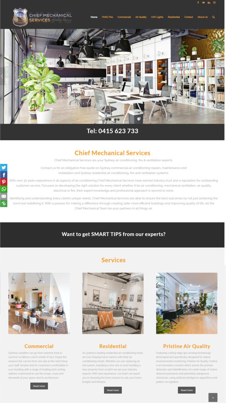
Chief Mechanical Services
Homepage vs Landing Page
I often hear people talk about a landing page, when in fact they mean a website’s homepage. I presume this is because often that is the first place that a person lands when they arrive on your website.
However, generally landing pages also referred to as capture, lead, squeeze or opt-in pages are pages built specifically for marketing campaigns.
They are usually designed with one call to action in mind, such as to collect email addresses. They don’t have any navigation buttons so as not to distract the visitor.
As the name suggests, it’s where a visitor “lands” after they click on an ad.
In most cases you can create landing pages on your website – this is especially true if you have a Wordpress website. You simply embed a form from your email automation software such as GetResponse, Mailchimp, Awebber or Constant Contact.
If you are looking to create more advanced landing pages and funnels, then check out Clickfunnels or LeadPages.
Here’s an example of a Landing Page.
How much content should be on a homepage?
There is no magic formula for the perfect amount of content on your homepage. This is something you will need to test over time with your website’s visitors.
When building any page on your website including your homepage, consider your visitor’s experience.
Most people will initially skim a webpage looking for information to help them solve a problem, so it is your job to make it easy for them to find it.
This is where great headlines, interesting graphics, smart calls to action and engaging videos come in.
A great homepage does not overwhelm the visitor with large blocks of text – instead it summarizes what your potential customer can find on the website.
Homepage navigation
On most websites, the navigation bar appears the same on all pages, so make sure it is clean and well structured.
People generally expect to see navigation at the top or to a lesser degree on the left handside. It is also a good idea to add a navigation bar at the bottom of your pages, so visitors don’t have to scroll all the way to the top to get onto the next page.
You can also add a Search box in your navigation bar, to make it fast and easy to find information.
Include “breadcrumbs” also referred to as “breadcrumb trails” if your website has hierarchically arranged pages. They show the user’s location on any webpage. Typically a breadcrumb trail will look something like this:
Home > Clothing > Women’s > Jackets
The content of page should be structured in a logical way, with clear headings and subheadings that guide the reader through the information.
Besides all the content you include on the front end of the website for your visitors to read, you also need to consider the search engines.
How many keywords should a homepage have?
There has been much discussion on how many keywords or keyphrases should be included on a homepage.
Neil Patel, one of the leading experts on search engine optimisation said:
“You should be keyword conscious and make an attempt to rank for certain keywords.
It’s just that you shouldn’t devote all of your energy for ranking for just one keyword — your branded keyword.
When you break it all down, the goal of your homepage should be to let Google know what the underlying theme of your site is and what type of product you’re offering.”
Neil also goes on to explain you should have 3 main goals when constructing your homepage:
Explain to Google and human visitors what your company/product does.
Facilitate intuitive navigation – Efficient site structure helps visitors find what they need and is a critical aspect of SEO.
Answer key questions visitors will have and quell any fear/skepticism they may have – This is done largely through rich content and social proof.
The interesting thing is that accomplishing these goals kills two birds with one stone.
Just think about it.
By including key components like keyword optimized headings, intuitive navigation, and rich content, you can appeal to search engines and human visitors.
It’s a win-win situation.
Read more about creating an Search Engine friendly homepage.
Homepage titles
Homepage title also referred to as a title tag is displayed on a search engine’s results page (SERPs) as a clickable headline. The optimal title length is 50-60 characters and should provide an accurate description of your homepage’s content.
Your title is also shown at the top of your web browser such as Google Chrome or Firefox and is often used by social networks to determine what to display when the page is being shared.
Learn more about writing good Title Tags.
Homepage title examples


Homepage description
Homepage description also referred to as meta description is a brief summary of your page which gets shown under a site’s title in Google’s organic search results.
The easiest way to include a Meta Description is to install a Search Engine Optimisation Plugin such as Yoast or All in One SEO. See example below for where to add the page description.
Your meta description should be approximately 160 characters long. However, it is important to know that Google won’t always display your meta description exactly as you have it, especially if Google feels your description does not adequately answer a user’s query,
Each page on your website should have its own meta description and should convey a benefit or value for the reader. It is a good idea to also include a call to action such as “Discover more” or “Learn more” and where possible, use keywords / keyphrases related to the page.
Homepage meta description examples


In summary …
Remember your homepage needs to be not only visitor friendly, but also search engine friendly and that means including content that is relevant to your business, which the search engines can read.
Search engines can’t easily index images, so don’t create a website which has very little text. For graphics that you do add to your website, ensure they have alt tags which are descriptive and include appropriate keywords.
When people arrive at your homepage, you only have a few seconds to get their attention and show them what your website is all about, so check that your website loads quickly and is mobile responsive.
If you include all the important elements on your homepage, your visitors are likely to stay for long enough to find out about your products and services and eventually convert into paying customers.
Don’t forget to check out Homepage Checklist Infographic.
*****
by Ivana Katz
Websites 4 Small Business – www.web4business.com.au; Ivana makes it easy for you to get your business online very quickly. If you’re looking for a professional and affordable website designer, CLICK HERE and download your FREE copy of “Ultimate Website Design Secrets Blackbook – 10 Bulletproof Strategies for Designing an Outrageously Successful Website”

