ask@web4business.com.au
Let Us Help You
Responsive Website Design
How many times have you pulled up a website on your phone, only to find that the text is too small to read and the buttons are too tiny to click? Or maybe you’ve tried to zoom in and scroll around, but ended up frustrated and annoyed. Well, guess what? That website was not responsive!
And we won’t let you make the same mistake.
Responsive web design is crucial for any website today, as more and more people use a variety of devices and browsers to access the internet.
By making your website responsive, we will ensure that it can adapt to different screen sizes and resolutions. This will provide a seamless and enjoyable experience for your visitors, regardless of whether they are viewing your web pages on desktop computers, mobile phones, mobile devices including tablets and laptops.
And as a bonus, responsive design can help improve your website’s search engine ranking, as Google gives priority to prioritize mobile-friendly sites.
Business Logo Design
Having a custom logo can do wonders for your business, like helping your customers recognize and remember your brand. It also shows that your business is professional and committed to quality, which is something that everyone loves.
But that’s not all! Having a unique and memorable logo can also help you stand out from your competition. In a world where everyone is fighting for attention, having a distinctive logo can make all the difference.
Plus, a business logo is a great way to create a consistent look and feel across all your marketing materials. Whether it’s on your website, social media profiles, or business cards, your logo will help tie everything together and create a cohesive brand identity.
Frequently Asked Questions About
Responsive Web Design
What is responsive web design?
Think of your website like a flexible rubber band. When you stretch it, it should be able to fit any size of object. That’s exactly what responsive web design does. It makes your website flexible and adaptable to different screen sizes, so it can be viewed on any device, whether it’s a computer, tablet or smartphone.
Responsive web design is a method of designing websites that automatically adjusts its layout and content based on the device being used to view it. This means that your website will look great and function properly on any device, without the need for a separate mobile site.
For example, imagine you’re browsing a website on your desktop computer. The layout is optimized for a large screen with multiple columns and detailed graphics. However, if you were to view the same website on your smartphone, the layout would adjust to a single column, with larger buttons and simplified graphics. This makes it much easier to navigate on a smaller screen.
The beauty of responsive web design is that it provides a seamless user experience, no matter what device someone is using. It also saves you time and money because you don’t have to create separate websites for different devices.
In short, responsive web design is a way of making your website look great and function properly on any device. It’s like a rubber band that stretches to fit any size of object, giving your website the flexibility it needs to reach a wider audience.
How does responsive website design work?
Responsive website design works by using a combination of flexible grids and layouts, along with media queries, to automatically adjust the size, layout, and content of a website to fit the device it is being viewed on.
Think of your website like a chameleon. Just like how a chameleon changes its colour to blend in with its surroundings, a responsive website changes its layout to blend in with the device it’s being viewed on.
When a user visits a website, the website checks the device being used to view it. It then uses media queries, which are bits of code that tell the website how to adjust its layout based on the device being used. This allows the website to adjust the size of responsive images, the layout of text, and even the number of columns on the page.
For example, if you’re viewing a website on your desktop computer, the layout might have multiple columns and large images. But if you switch to your smartphone, the website will automatically adjust to a single column and smaller images to fit the smaller screen.
The result is a website that looks great, has a fast page load and functions properly on any device, without the need for a separate mobile site. The mobile version of your website provides a seamless user experience and makes it easier for people to access your website on the go.
Is responsive web design important for SEO?
The short answer is yes, responsive web design is very important for SEO. In fact, Google has officially recommended it as the best practice for building websites.
Here’s why: responsive web design makes your website more user-friendly, and a user-friendly website is more likely to rank higher on search engine results pages (SERPs). When people visit your website, they are more likely to stay on it and engage with your content if the website is easy to navigate and looks good on their device.
In addition, responsive web design helps to reduce bounce rates, which is when people leave your website after only viewing one page. High bounce rates can hurt your SEO rankings because search engines interpret it as a signal that your website is not relevant or engaging.
Think of your website like a restaurant. When people go to a restaurant, they expect to have a good experience. They want the menu to be easy to read, the food to be presented nicely, and the atmosphere to be comfortable. Similarly, when people visit your website, they want it to be easy to navigate, visually appealing, and optimized for their device.
If your website is not responsive, it’s like serving food that is not properly cooked or presenting it on a dirty plate. People won’t want to come back, and they might even leave a bad review. This hurts your reputation, just like how a non-responsive website hurts your SEO rankings.
What is the difference between responsive web design and adaptive web design?
Responsive web design refers to a design approach where the website is designed to adjust its layout and content to fit the screen size and resolution of the device on which it is being viewed. This means that the website will look different on a desktop computer compared to a mobile device, but it will still maintain the same content and functionality. In other words, the web design features fluid layouts which are responsive to the size of the screen, but the content remains the same.
Here’s an example: Let’s say you have a website with a navigation menu that spans the top of the screen. On a desktop computer, the menu may display horizontally across the top of the page. However, on a mobile device, the same menu may be displayed in a collapsible hamburger menu in order to save space on the smaller screen.
Adaptive web design, on the other hand, is a design approach that uses multiple layouts and designs for different device types. With adaptive design, the website is able to detect the type of device being used and then display a layout and design as well as font size that is optimized for that specific device. This means that the content and layout may be different on a desktop computer compared to a mobile device, and the website may even have different functionality depending on the device being used.
Here’s an example: Let’s say you have a website with a complex interactive map. On a desktop computer, the map may be displayed with all its features and functionality. However, on a mobile device, the same map may be simplified and only display basic information such as markers for key locations, in order to improve load times and usability on a smaller screen.
How can I test my website’s responsiveness?
The first thing you need to do is make sure you understand what “responsiveness” means in website terms. Essentially, a responsive website is one that can adapt and adjust to different screen sizes and devices, such as desktops, laptops, tablets, and smartphones. This means that your website should look good and be easy to navigate no matter what kind of device someone is using to view it.
Now, let’s talk about how you can test your website’s responsiveness. There are many responsive design checkers available online, both free and paid. Some popular options include Responsive Design Checker, BrowserStack, and Screenfly. Simply enter your website’s URL into the tool, select the device and screen size you want to test, and voila! You can see how your website looks and functions on that device.
Another way to do it is through Chrome’s “Inspect” Tool.
- Open Google Chrome on your computer and navigate to the website you want to inspect.
- Right-click on the website and select “Inspect” from the dropdown menu. Alternatively, you can press the F12 key on your keyboard to open the Inspect tool.
- The Inspect tool will open in a separate window or pane. At the top of the Inspect window, you will see a set of icons representing different devices. Click on the “Toggle device toolbar” icon (or press Ctrl + Shift + M) to activate the device toolbar.
- Once the device toolbar is activated, you can select different device types and screen resolutions from the dropdown menus. You can also drag and resize the viewport to simulate different screen sizes.
- As you change the device type and screen size, the website will dynamically adjust to fit the viewport. You can use the Inspect tool to identify any issues with the website’s responsiveness, such as elements that are too large or too small for the screen.
- You can also use the Inspect tool to inspect individual elements on the page and see how they are styled at different screen sizes. To do this, click on the “Select an element” icon (or press Ctrl + Shift + C) and hover over the element you want to inspect. The Inspect tool will highlight the element and show you its styles in the Styles panel.
- Finally, you can use the Inspect tool to simulate user interactions on the website, such as clicking links or filling out forms. To do this, click on the “Toggle device toolbar” icon and select the “Sensors” tab. From here, you can simulate touch events, geolocation, and more.
I hope that helps! Let me know if you have any further questions.
Another way to test your website’s responsiveness is to simply view it on different devices yourself. If you have access to a variety of devices, such as a desktop computer, laptop, tablet, and smartphone, you can view your website on each one and see how it looks and functions. This can be a bit more time-consuming than using a responsive design checker, but it can also give you a more accurate idea of how your website behaves on different devices.
How much does it cost to set up a website?
Setting up a website can be an overwhelming and intimidating task, but it doesn’t have to be expensive. The cost depends on the complexity of the design, number of pages, and available content; however, we have put together website design packages that make it easy – and affordable – to get your site up and running quickly.
These are some of the element that go into creating a website:
- Domain name registration
- Webhosting
- SSL Certificate
- Website design and set up
- Additional functionality and integrations such as eCommerce, membership portal, social media feeds
Check out or website design packages or contact us for custom quotes
How long will it take to create my website?
The time frame for creating a website depends on several factors, such as the complexity of the design and layout, the number of pages, the availability of content and how quickly you come back to us with feedback.
For example, if you already have all of your necessary content prepared, then it will take us 7-10 days to set up your website. However, if we need to create custom elements like logos or add more complex functions such as a shopping cart or member portal, it could take 3-4 weeks to complete.
Overall, it’s best to plan ahead and be as specific as possible when deciding what features you want included on your website. That way we can make it as part of the design process and we can let you know ahead of time how long it will take.
Having an estimated completion date in mind will also help streamline the process and ensure that the project is completed on schedule.
Testimonials

We had a fantastic experience with Ivana from Websites 4 Small Business in designing and developing our new company website. Ivana is highly professional, responsive and talented. She is an expert in her field and provided a range of excellent resources to assist in decisions about the website. Her communication throughout was excellent and she was an absolute pleasure to deal with. We love our new website and highly recommend Ivana!

I have found dealing with Ivana really easy. She was so patient with me & my lack of computer/technical knowledge. Even though I live in another state & have not met her she was so helpful when I spoke to her over the phone at length about what I needed for my business. It is so good to have someone in your corner that is approachable – no call centres or different people every time.
Some of Our Clients’ Responsive Websites
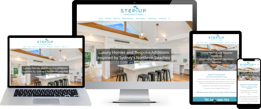
Stepup Constructions
EmpowerGirl
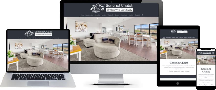
Jindabyne Getaway
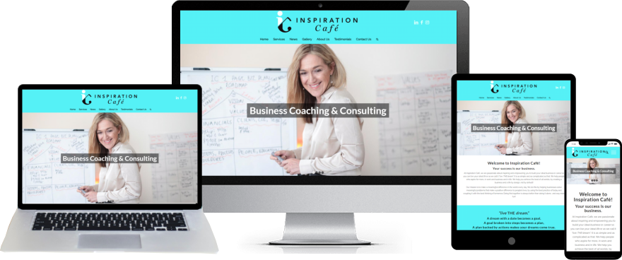
Inspiration Cafe
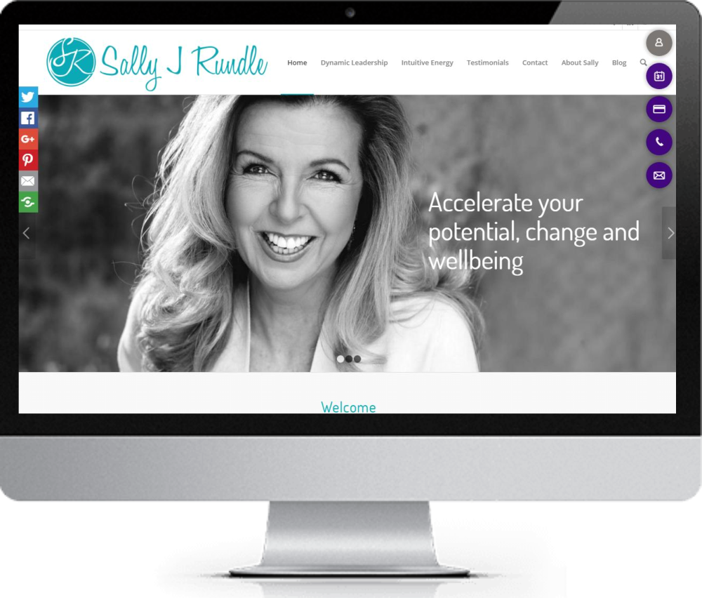
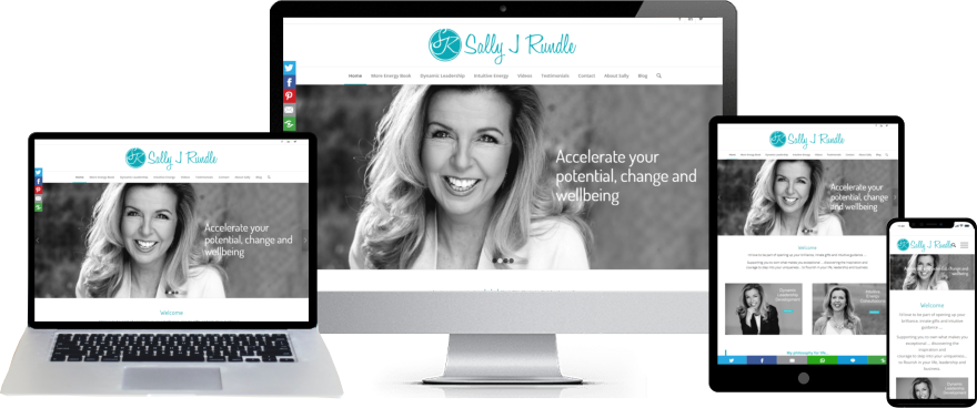
Sally J Rundle
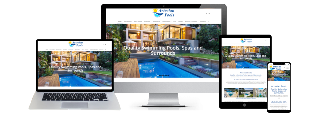
Artesian Pools
Web Design Packages
Starter Web Design Package
Our Website Starter Package is here to help! With custom designs and technical support, you can rest assured that your site will launch smoothly and look professional. Plus, you won’t need to worry about the user experience – everything you need is included in one convenient package. This means you can focus on your business without the hassle of figuring out responsive web design.
Business Web Design Package
If you’re aiming to make the most out of your website, the Business Package could be just what you need. This package offers lots of great features, including custom design options and integrated tools like a blog and photo/portfolio gallery. By choosing this package, you’ll be able to show off your services in the best possible way and unlock your website’s full potential.
Premium Web Design Package
Our Premium Package cmes with all the amazing features of our other two packages, plus some exclusive extras like Social Media Sharing, One Click Call, and Google Maps integration. With this package, you can showcase your products and services in the best possible light and unlock your business’s full potential.


