5 Web Design Hacks to Boost Your Conversion Rates
Web design can make or break a business.
A beautifully designed website that predicts and meets user needs is more likely to make consumers stick around. It can also encourage people to trust a brand. It can enhance engagement rates. And, perhaps most importantly, it can positively affect conversion rates.
Still, let’s face it. Conversion-boosting web design isn’t always straightforward. It doesn’t just necessitate a strong understanding of your audience’s wants and needs. It also requires in-depth web user behaviour research to provide all visitors with an unmatched browsing and shopping experience.
So, if you’re searching for ways to boost conversion rates, here are the best web design hacks to help you achieve your goal.
Demonstrate You Understand Your Audience
When making shopping decisions, consumers consider multiple factors.
For some, their main priority includes receiving high-quality solutions at a fair price. Others prioritize customer experience, looking for businesses that provide superior post-purchase support. Some people (more than 50% of Australian consumers, to be precise) want to support businesses based on their ESG values.
But the thing is, no business can do everything exceptionally well. To build a website that appeals to your target audience, work to understand your prospects’ priorities. Then, you must demonstrate your dedication to meeting user needs.
If you’re not entirely convinced that doing so can help your conversion rates, consider the following. 79% of people say that a brand must show they understand and care about them to consider purchasing. And, remember, the reward for showing you care won’t just include a higher conversion rate. It might also yield higher customer satisfaction and elevated loyalty.
But how do you use web design to win over your audience through understanding? Well, it can be simple. All you have to do is utilize the high-impact sections of your website to address your prospects’ pain points. Then, show how you intend to remove those pain points.
For example, Telstra understands that its business users require solutions that boost productivity. So, by inviting web visitors to “put tech to work,” the brand directly addresses a common frustration — the fact that tech doesn’t always work like it’s supposed to — and creates an opportunity to describe all the benefits its services offer.
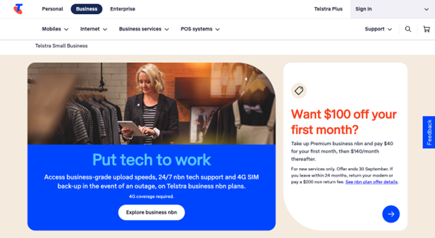
Image source: telstra.com.au
Elevate Brand Trust with Impactful Social Proof
What do people do when they find themselves in a situation where they’re not experienced enough to make an informed decision? They look to others for advice.
According to buyer behaviour analyses, the majority of consumers research their purchases. In fact, Power Reviews discovered that 97% of people depend on social proof (reviews and ratings) when making purchase decisions.
Are you looking for tactics that will help you enhance your website’s design with conversion-boosting elements? In that case, you must utilize social proof in a way that will help web visitors comprehend your brand’s credibility and expertise.
There are numerous ways to include social proof on your website to boost trust and sales.
For example, if you check out the Sell Your Business page on Businessforsale.com.au you’ll notice this brand utilizes the power of measurable data. It points out that 250+ owners sell their businesses through the platform every month. It highlights the brand’s 36 years of experience. And it emphasizes the fact that it charges a 0% sales commission. These pieces of info are all easy to check. Yet, what they do is communicate the brand’s trustworthiness, making it an exceptional choice for anyone looking to buy or sell a business.
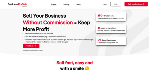
Image source: businessforsale.com.au
Or how about Bunnings Warehouse? This brand understands that product reviews directly impact consumers’ willingness to click the “Buy” button. That’s why it includes star ratings below every featured product on its homepage, relying on positive social proof to attract shoppers’ attention and inspire them to convert.
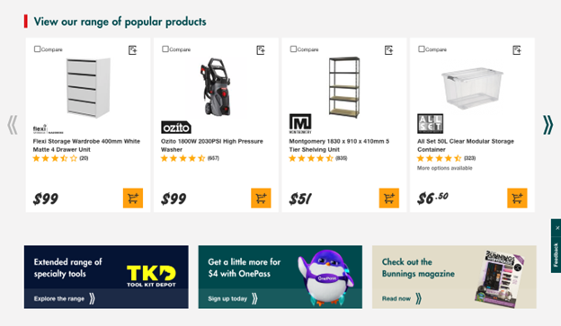
Image source: bunnings.com.au
Minimize Consumer Risk with CX-Boosting Elements
If you’re trying to implement web design hacks to boost your conversion rates, you must first understand why people fail to convert when shopping online.
According to the Baymard Institute, some of the most common reasons for buyers abandoning their carts include:
- High extra costs.
- Complicated checkout process.
- Lack of brand trust.
- Insufficient cost transparency.
- Dissatisfactory returns policy.
- Poor site performance.
- Insufficient payment methods.
And what do most of these factors have in common? They open up your buyers to a lot of unnecessary risk.
So, if you’re looking for web design strategies that will help you increase sales, why not consider minimizing said risk with web elements that target your audience’s customer experience?
For instance, in Australia, 81% of buyers expect free shipping when they spend over a specific sum. So, to win these consumers over, make it really easy for them to figure out if they qualify for free shipping.
If you check out Dossier, you’ll see that adding an item to the cart immediately pulls up a pop-up window. Here, buyers can see how many more items they have to purchase to qualify for a discount and free shipping. Plus, the brand uses cross-selling to encourage web visitors to increase their order value. That’s an exceptional way to boost revenue without having to invest in additional advertising.
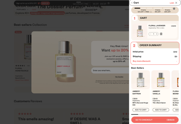
Image source: trydossier.ca
Alternatively, check out Infraredi’s LED Light Therapy product page. Here, the brand clearly states that:
- it offers a medical-grade quality guarantee
- buyers get a 60-day risk-free trial
- shipping is free
- the product comes with a premium 3-year replacement warranty
All of these are important factors for buyers. But what stands out is that they’re communicated in a way that’s direct, easy to understand, and relevant to people looking at the product page.
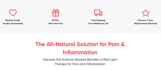
Image source: infraredi.com.au
Help Prospects Find the Right Solution for Their Needs
Sometimes, the reason people don’t convert isn’t that they’re unhappy with the benefits your brand offers. Instead, they’re overwhelmed by the number of choices available.
In fact, research shows that consumers who have difficulty choosing the best solution for their needs have a 22% higher chance of abandoning their shopping carts.
So, if you’re looking for ways to elevate your conversion rates by investing in your site’s design, explore opportunities to make the product evaluation process more pleasant for your target audience.
For example, you can invest in content that assists your audience during their shopping. Whether this is an in-depth buying guide or an interactive quiz like Asics’ Shoe Finder is up to you (and your budget). Rest assured that helping web visitors during their shopping process and presenting them with relevant and personalized product recommendations offers a tremendous opportunity to maximize sales.
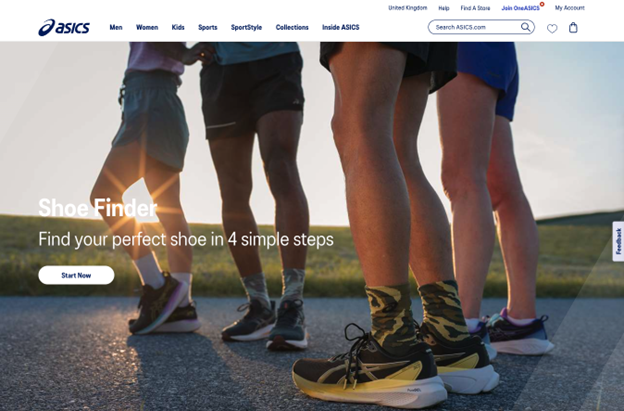
Image source: asics.com
There are other web design hacks that can elevate the shopping experience and boost conversion rates.
For example, research shows that, when buying online, 75% of people primarily rely on product photography to evaluate potential solutions.
So, invest in high-quality product images, allow buyers to look at products from different angles, and incorporate alternative views into your product collection pages — like you can see on the Beach Cover Ups page on Simply Beach. That way, you can assist your audience and give them sufficient visual info to inspire them to go deeper into the product evaluation process.
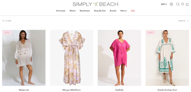
Image source: simplybeach.com
Communicate Brand Authenticity
Sometimes, consumers might be unable to form an emotional connection with your brand. And while this may seem trivial, it’s a pretty impactful conversion killer.
Experts say people make 95% of their buying decisions based on emotions. If you want to encourage your prospects to convert, you must make your brand irresistible.
Now, appealing to your audience’s feelings with visuals, copy, or urgency-inducing UX elements is an excellent tactic. However, if you want to ensure your web visitors want to choose your brand, no matter what, the best way to achieve the goal is to convince them of your brand’s authenticity.
You see, at the end of the day, people don’t want to give their hard-earned money to faceless corporations. On the contrary, 56% of people want to support small businesses over big brands. Why? Because these companies tend to be more authentic.
With this in mind, share the uniqueness and relatability of your business. Something as simple as telling web visitors about your experience and background can be a great way to connect with potential customers. For example, take a look at how Eden Emerald Mortgages did it:
Or, you can go a step further. Why not share your brand mission and values with your prospects? That way, they can know they’re making a buying choice that aligns with their life philosophy.
If you check out Bombas, you’ll see how proud the brand is of its give-back program. What stands out is that the company uses homepage copy to highlight the role buyers play in making its mission happen. Ultimately, people may not exactly see socks as a life-changing purchase. But, by knowing that the company they’re buying from uses its profits to help a community, it’s far more likely that socially-conscious shoppers will want to buy from this particular brand.
Image source: bombas.com
Final Thoughts
Investing in web design is always a good idea — especially if you’re aiming for elevated conversion rates.
The hacks discussed in this article are an excellent start. However, if you want to maximize your website’s capacity to convert new customers, always make sure you’re making design decisions that align with your audience’s preferences.
In other words, take the advice from this article. Then, adjust it to your needs.
The best way to do this is, naturally, to test website user behaviour and track KPIs. Whenever you see an opportunity to improve your site’s appearance (or performance), don’t hesitate to use it to your advantage. After all, boosting sales can be as easy as using better product pictures, composing more targeted headings, or showing off social proof. So make sure you implement these hacks, as they’re guaranteed to benefit your business.
***
Sarah Kaminski


